
In early 2015, a product manager in IBM's Analytics unit created the IBM Predictive Analytics Online Community. The community had three components joined by a single landing page: a blog hosted on a Wordpress platform, a forum hosted on IBM's instance of AnswerHub, and an Extensions Gallery hosted on GitHub.
Later that summer shortly after I joined the SPSS Statistics team as a Designer, we ran a 30/60/90 Digital Refresh project effort to improve the Discover-Try-Buy funnel for IBM's SPSS products (Statistics and Modeler), which included leveraging the online community as a marketing and support tool.
In terms of the online community's role in the Discover-Try-Buy funnel, marketing, support, and product had different ideas:
We kicked off the Digital Refresh project with a two-day design thinking workshop to determine key personas, identify pain points, and define goals.
The online community as it already existed was created from one of IBM's Wordpress templates, and I had been tasked with ideating a new visual design for the landing page prior to the Digital Refresh project; this task became my primary focus for the 90 day duration of the project.


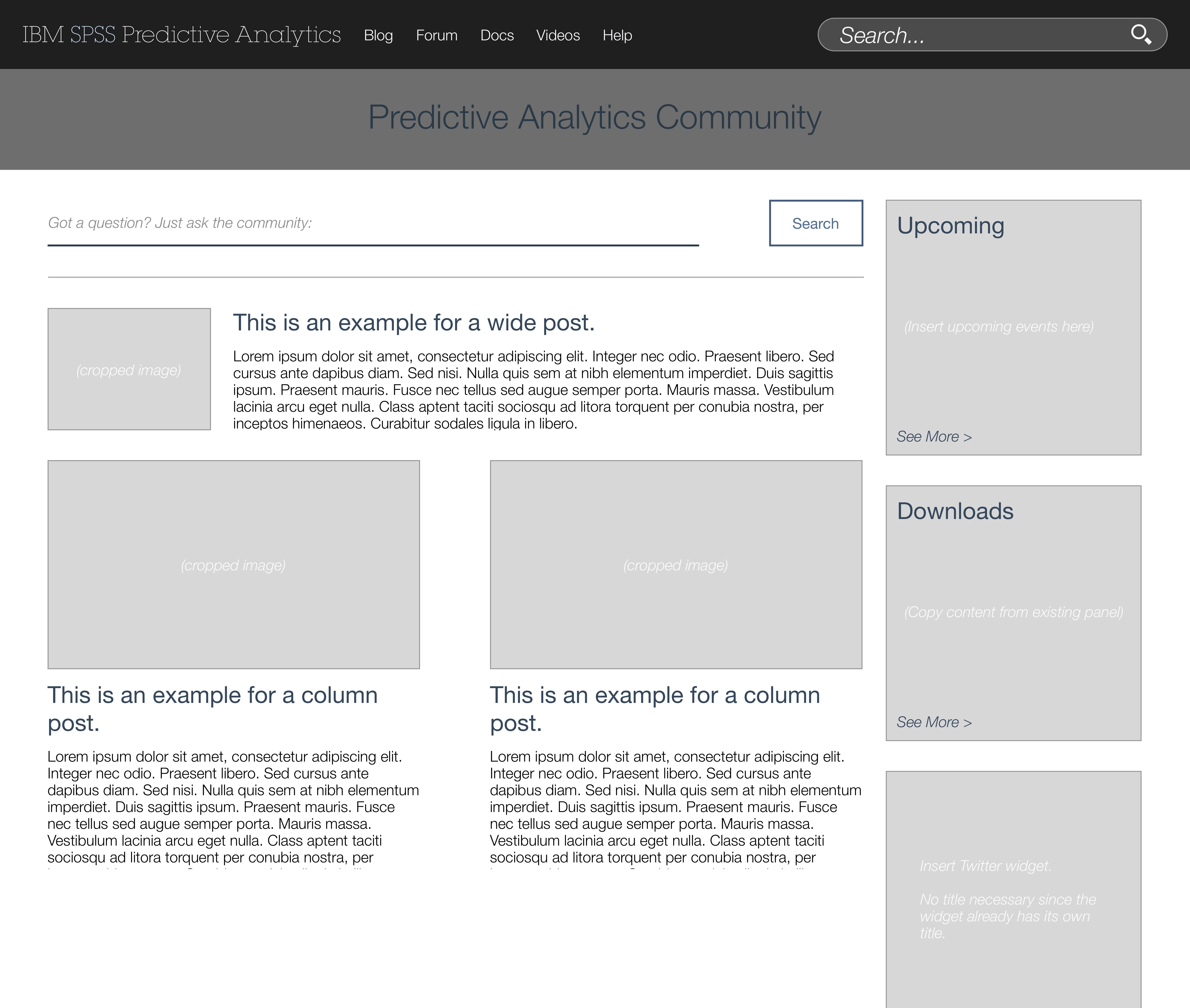
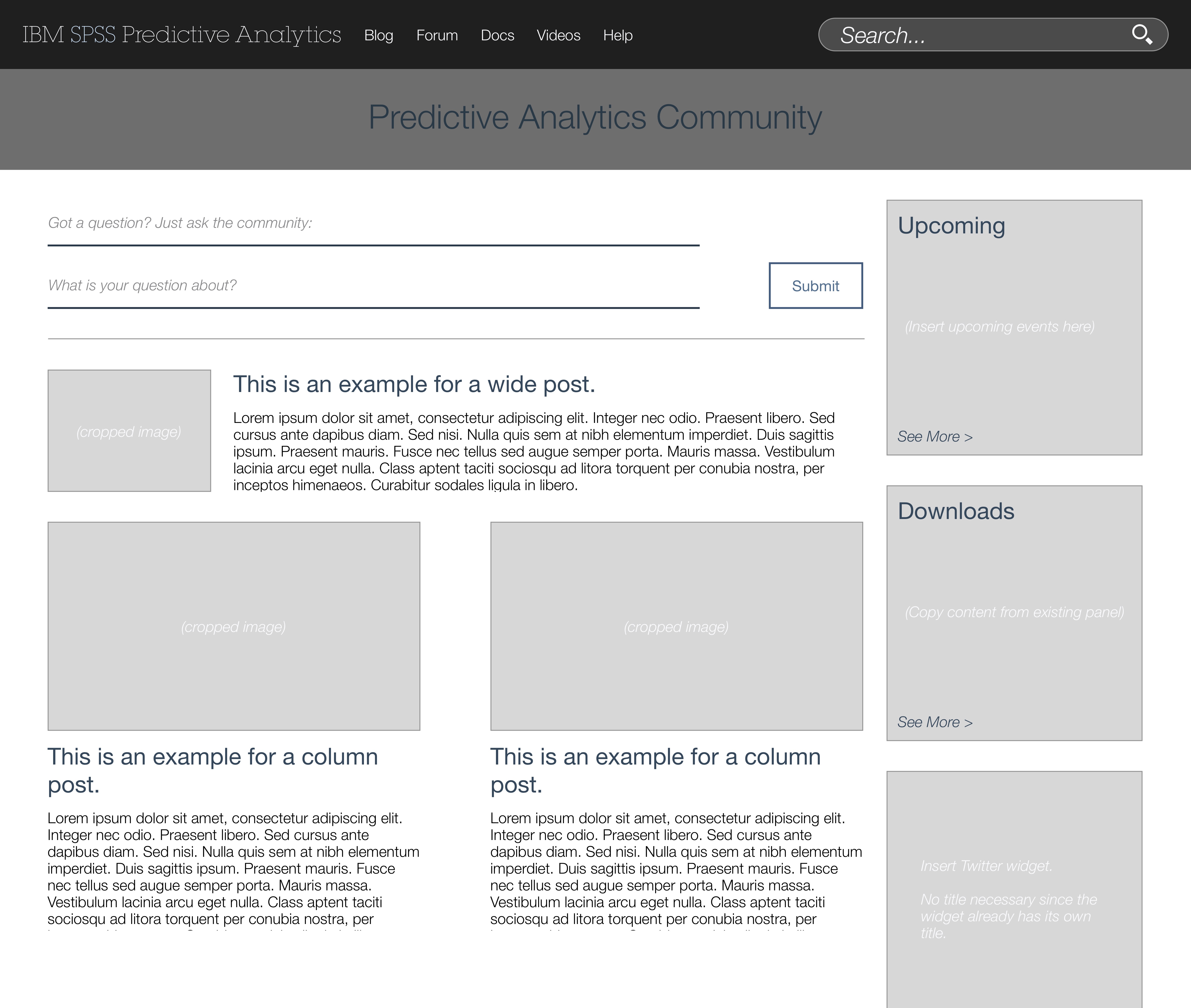
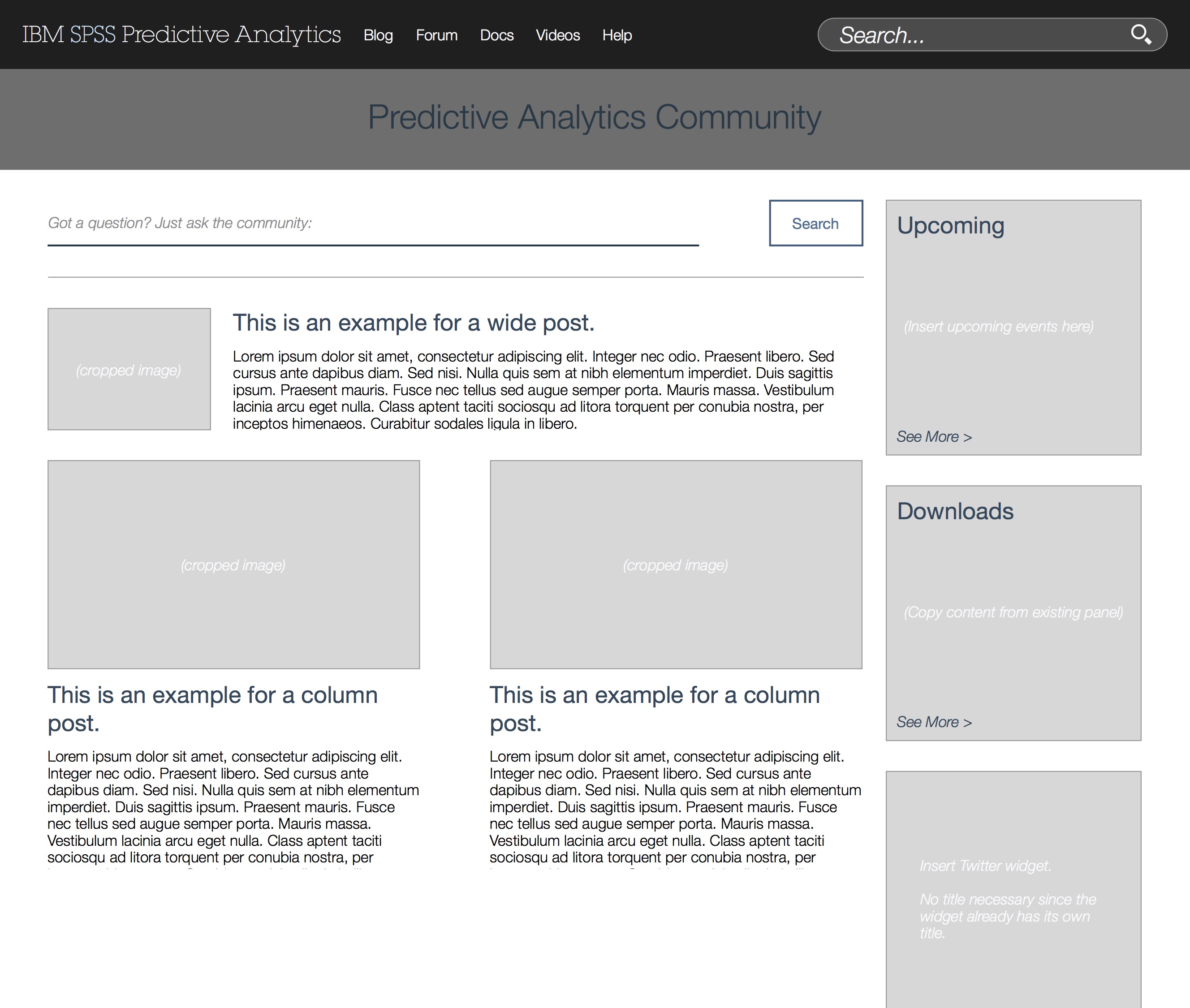
In the beginning, I focused on wireframming based on the requirements given by other stakeholders in the project. After gathering sketches from the heads of marketing and support, I created a series of wireframes for the landing, support, and developer pages with alternate versions for feedback review.
Around halfway through the project, we lost the developer that had been allocated to this project, and we were starting to slip on other deadlines. At this point, I took on full ownership for the design and development of the online community, taking on a larger role in driving the design process as opposed to wireframing based solely on requirements and feedback provided.
Because we had a bit of a time crunch to complete the community's redesign by the 90-day deadline, I broke the usual design process and begin working primarily in code.
The community's product manager and I looked at other online communities, both internal and external, for visual design inspiration and content strategy references. The community had originally been created with the intention of highlighting SPSS's extensibility, but we decided that success for the 30/60/90 project required a stronger emphasis on predictive analytics in general.
I used our comparative analysis and developed a hierarchal flow for the landing page; I also created a visual identity for the community that blended SPSS's legacy with IBM's then-new design language.
During this project, I learned about taking ownership of a process; even though this was my first major project as a working designer, that shouldn't have been a reason for me to take the backseat to other stakeholders in the project.
The redesigned community was launched on time at the end of the 90 days, and viewership increased to over 20,000 hits within the first month.
The community manager and I had also developed a roadmap for the community, which included instrumenting it for website analytics so we could identify ways to better improve the community and redesigning the Extensions Gallery experience to become more social and App Store-like.