Designing for mobility
For nearly two years at Ridecell, I worked on several initiatives for their Mobility as a Service platform. Here's some snapshots of that work.
I worked on a couple of initiatives there:
Improving funnel retention and conversion
One of Ridecell's products was a white-label carsharing platform spun off from their original product (the company initially launched as an Uber competitor).
In 2017, AAA a launch party in Oakland, CA for their carshring service GIG, giving us a chance to see peoples' experiences with the registration funnel. Aside from cell towers being overloaded that afternoon, we noticed several pain points, largely to do with various user and identity verification steps.
Running specific API calls through Mixpanel, I was able to roughly piece together what the drop-off rates looked like over the span of a month post-launch and could corrobrate some of our observations:
- Launch party attendees wree already iffy about being asked for payment information so early, and no identity verification had taken place by that point in time yet.
- I hypothesized that any error in phone number verification so late in the funnel either resulted in significant frustration or could have been a signifier for potential fraud.
These and other observations were futher validated when I encountered another customer having a stall at a street fair while on vacation.
I redesigned the registration flow based on both the pain points we observed and standard user onboarding practices/principles. The new redesigned experience was launched with two customers in Europe and saw a nearly two-fold increase in user retention; similar improvements were also observed when AAA's GIG Car Share received this redesign.
Architecting white-label mobile apps
One of my first projects at Ridecell was to help establish a framework for their white-label mobile applications.
One track was to establish an information architecture that would support multi-modal mobility solutions (this was not prioritized), another track was to improve the the user experience (this was prioritized).
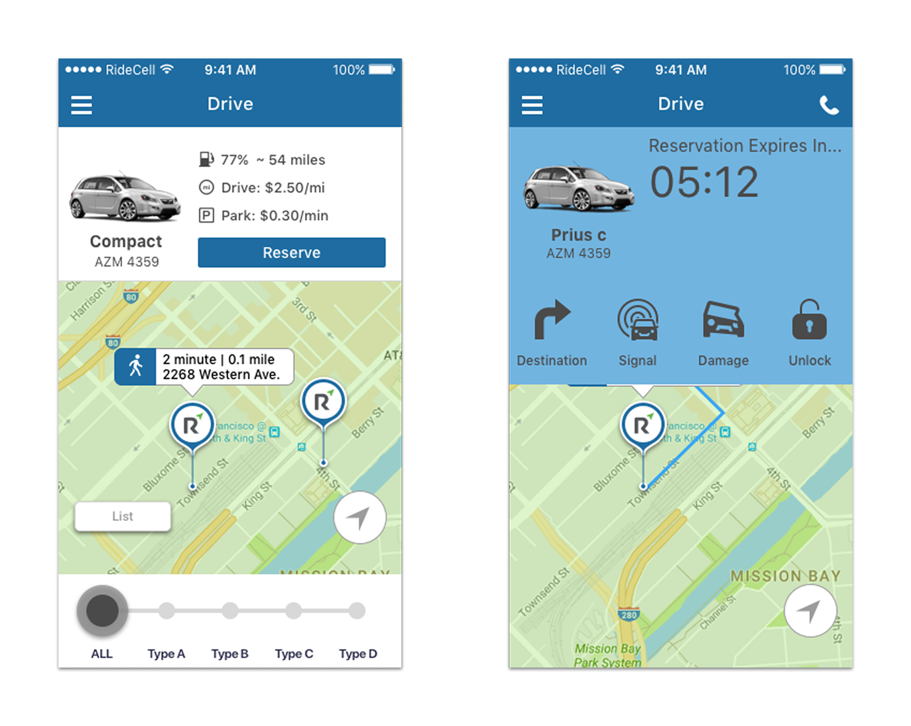
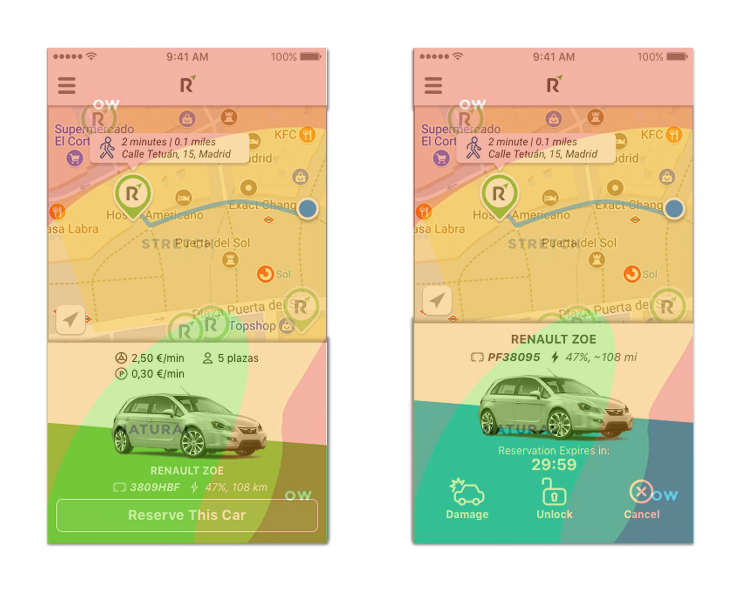
Back in 2014, phablets had made it from the domain of tech enthausiasts to the mainstream consciousness wehn Apple introduced the iPhone 6 Plus. With its main controls anchored to the top of the screen, Ridecell's mobile applications had a bit of an ergonomic challenge with these larger devices.
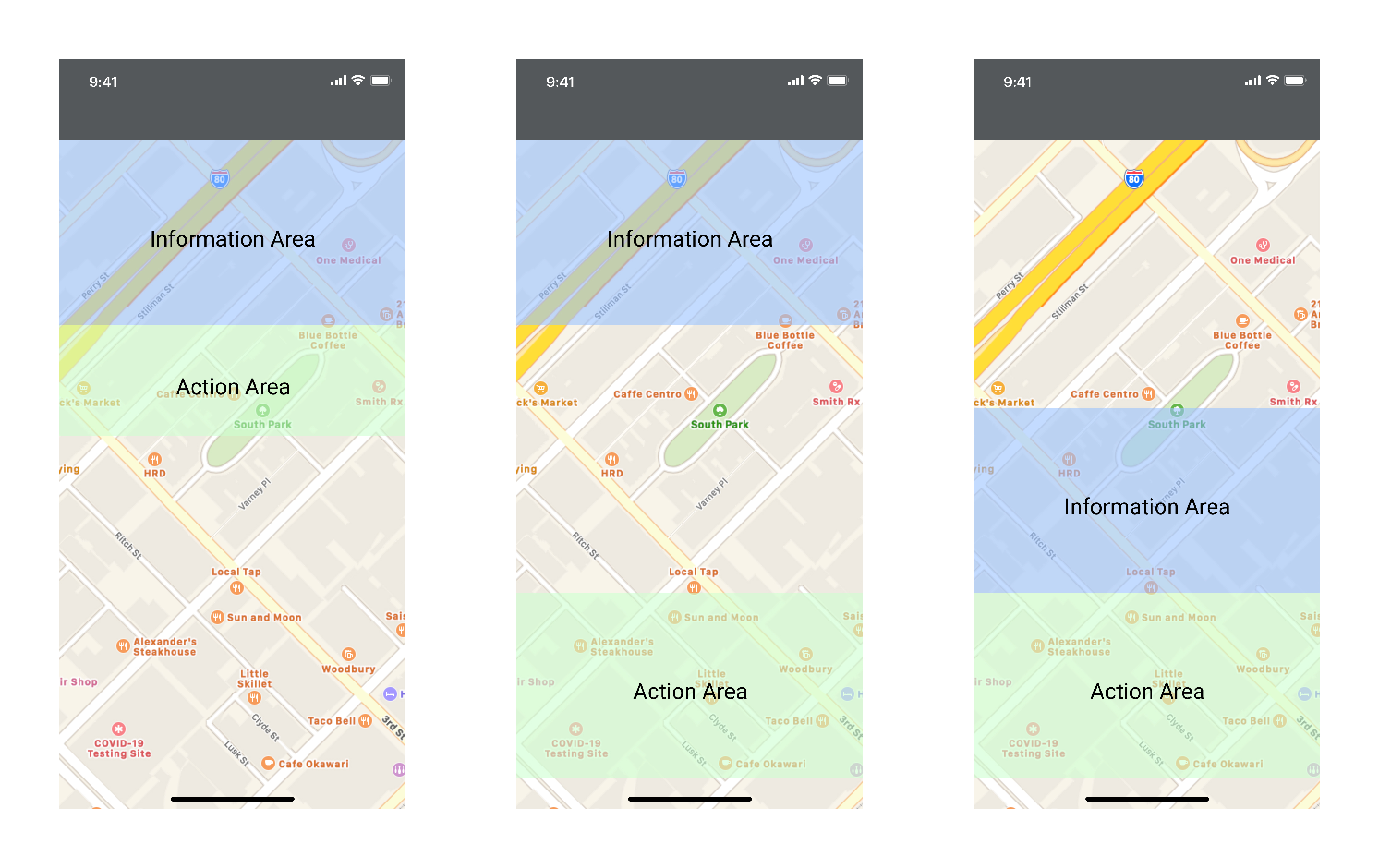
To address both information hierarchy and usability, I broke down the visual structure of our mobile apps by first moving key interaction elements to the bottom of the screen, architecting an Information > Context > Action structure. As we began to do some hallway tests and visual explorations, we eventually progressed towards a Context > Information > Action structure.
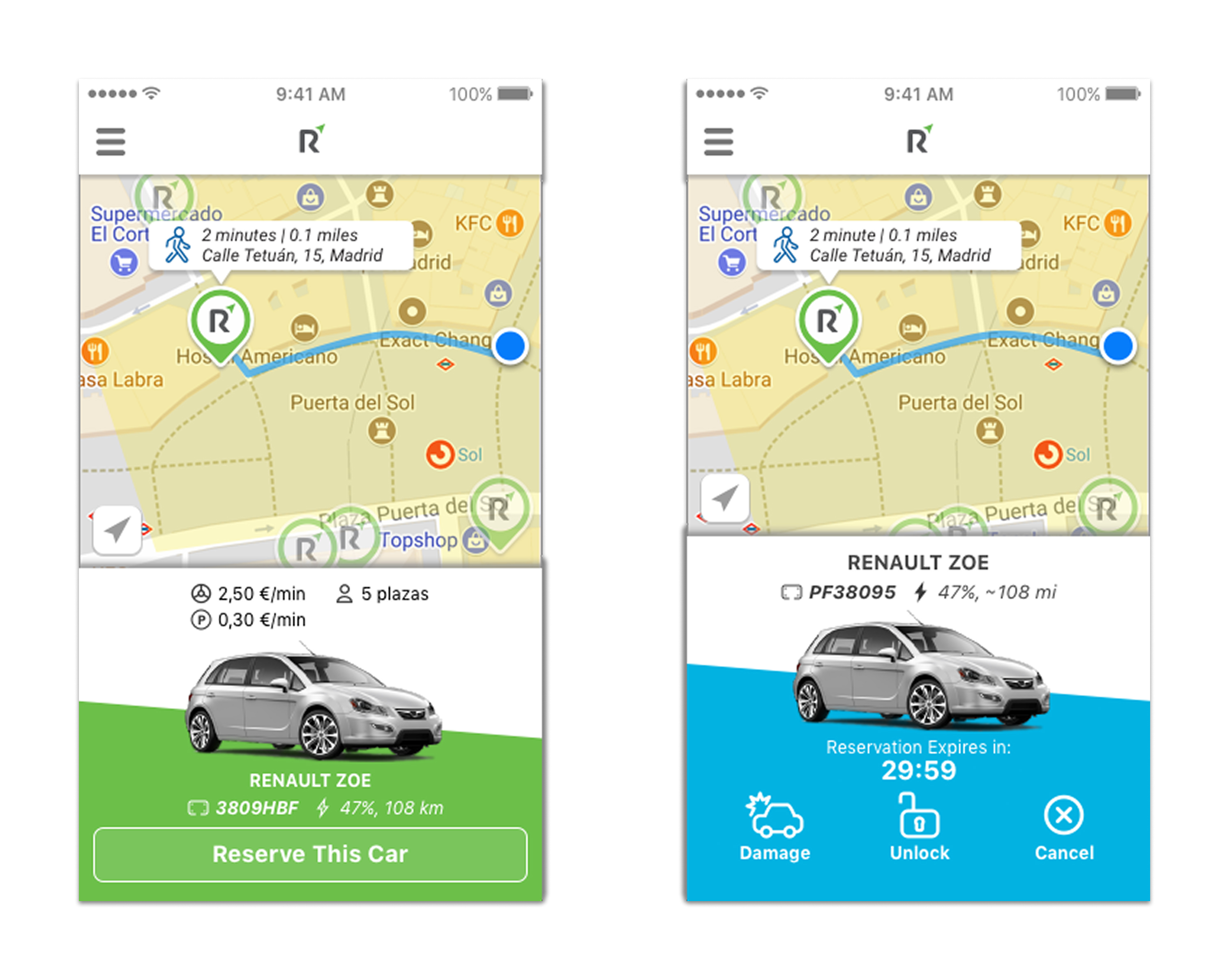
Not only was this an improvement for reachability, this layout both afforded us more room for a map context and oriented the user's journey in the app around "Where am I and how can I get to where I want to go?".
It also helped us consolidate points of customizability by reducing the number of components in the UI, making it easier for us to build and deploye a flexible platform that could cleanly represent our customers' brands.
Designing for drivers
As the company grew, so did our platform. While Ridecell started off pivoting from an Uber competitor to a white-label carsharing and ridesharing platform, we also began to go into fleet operations and management to give our customers a single, more comprehensive platform.
We already had a fleet operations webapp for operation centers, but we needed to provide tools for employees out in the field.
The backend architecture had already been defined for this project, but we knew that our existing UI framework couldn't be applied to this project: these field employees would likely be using this application would out and about, and their ability to use the app with their phone mounted to their dashboards was paramount.
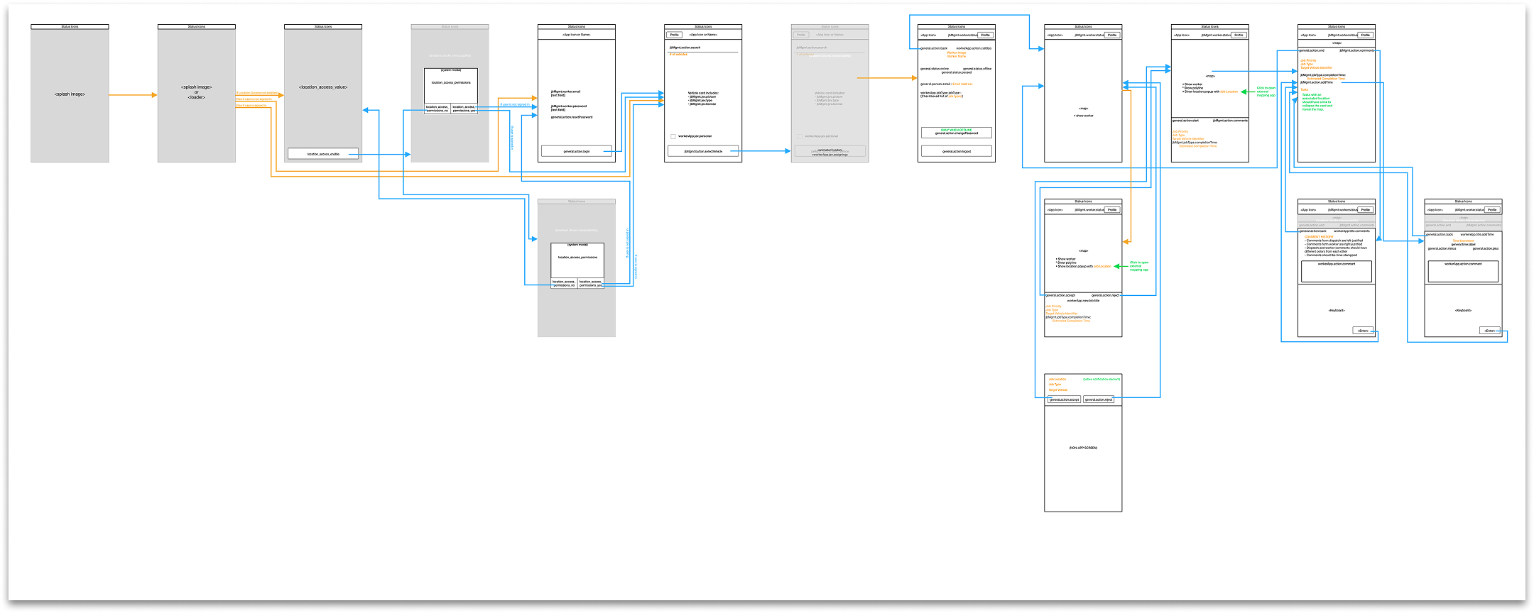
To enable the engineering and design teams to work in parallel, I mapped user interactions based on initial information provided by one of our customers to API calls and responses so that engineers could build while we designed and tested. This mapping helped keep design and engineering aligned and made it easier to comminucate when either team needed the other to accommodate a change.
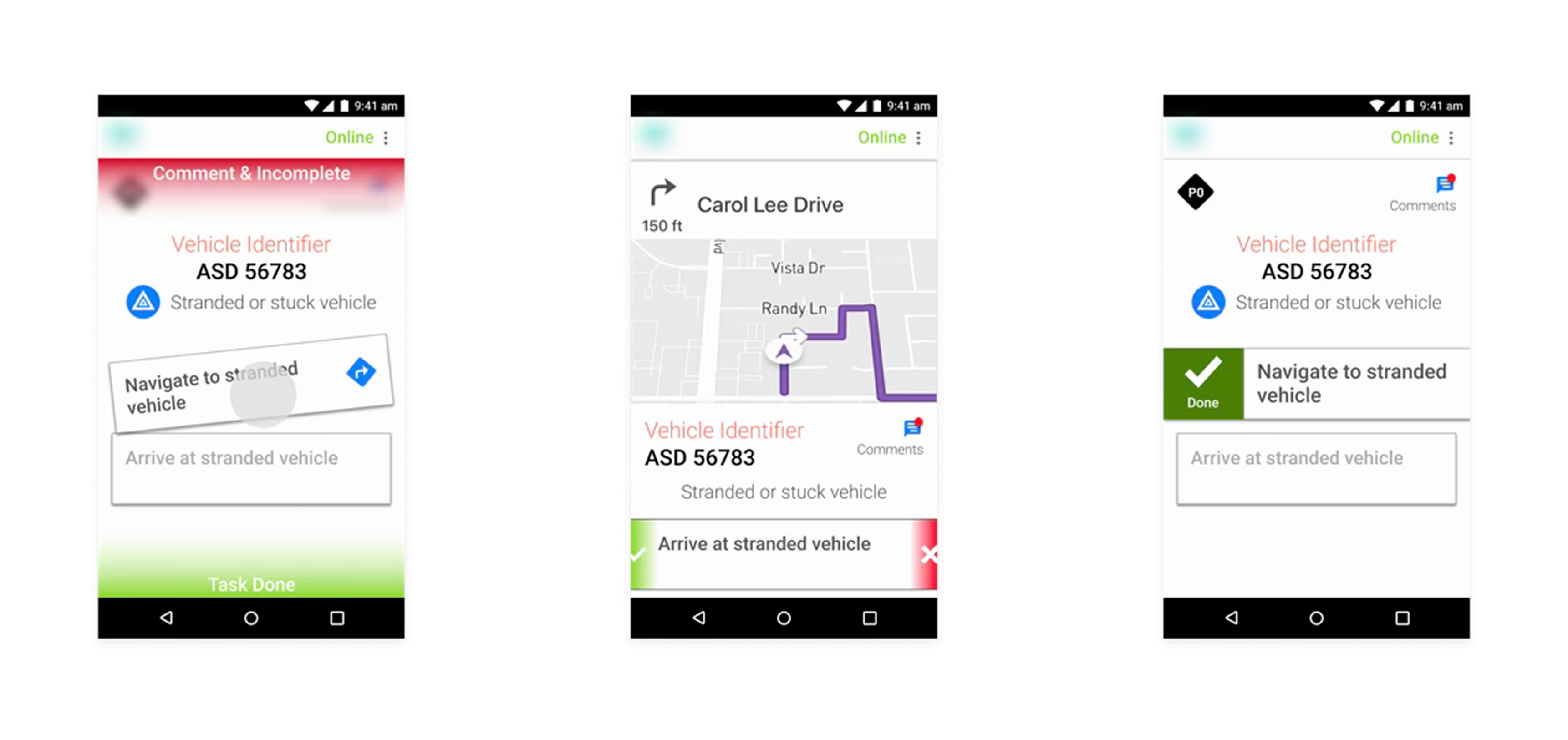
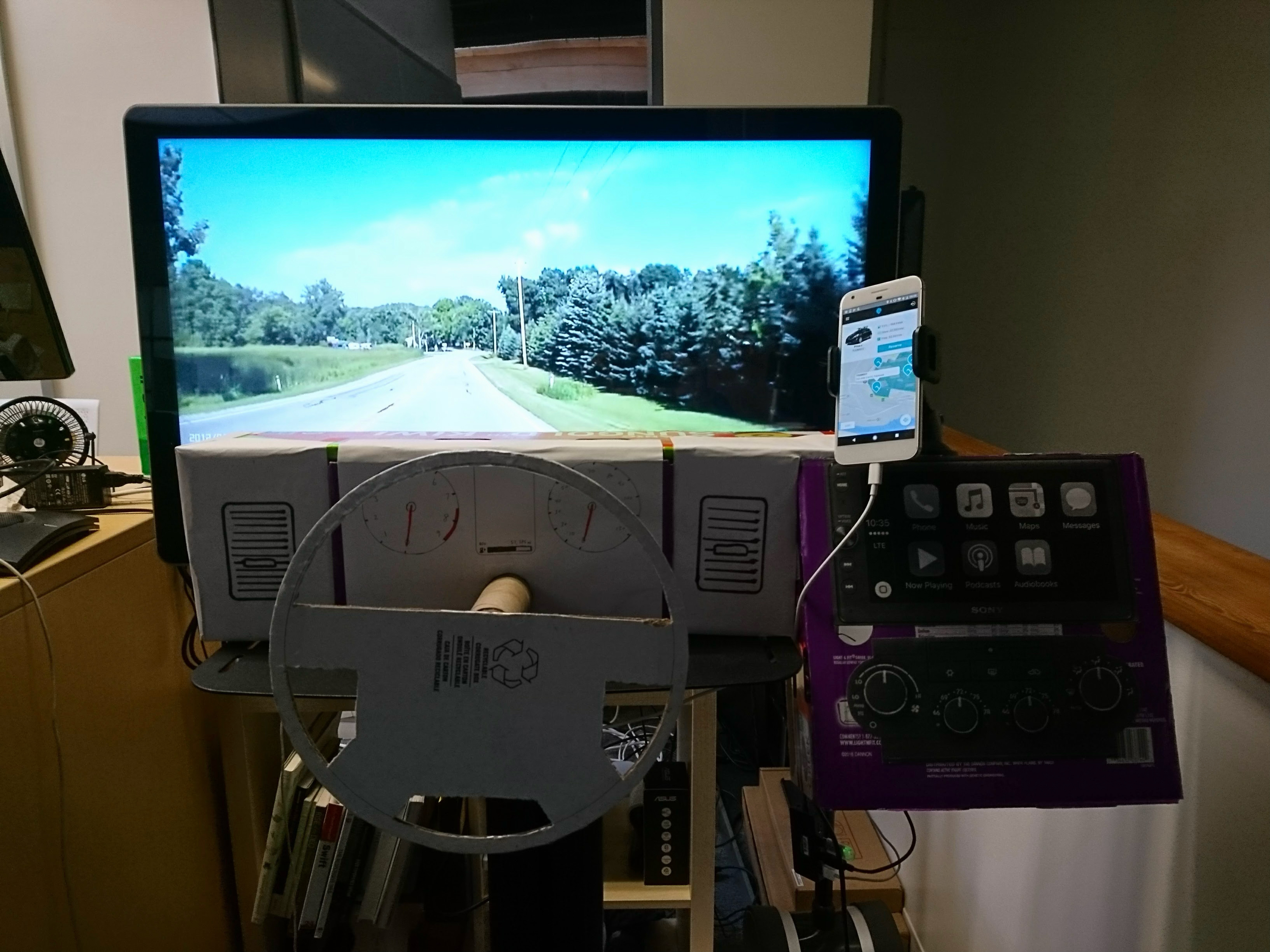
Once our team had an initial prototype ready, I built a rig to support hallway testing this mobile app by simulating a driver's environment as closely and as safely as possible.
This gave us a convenient setup to quickly test and iterate until we reached a point where we felt comfortable deploying a beta to one of our customers.
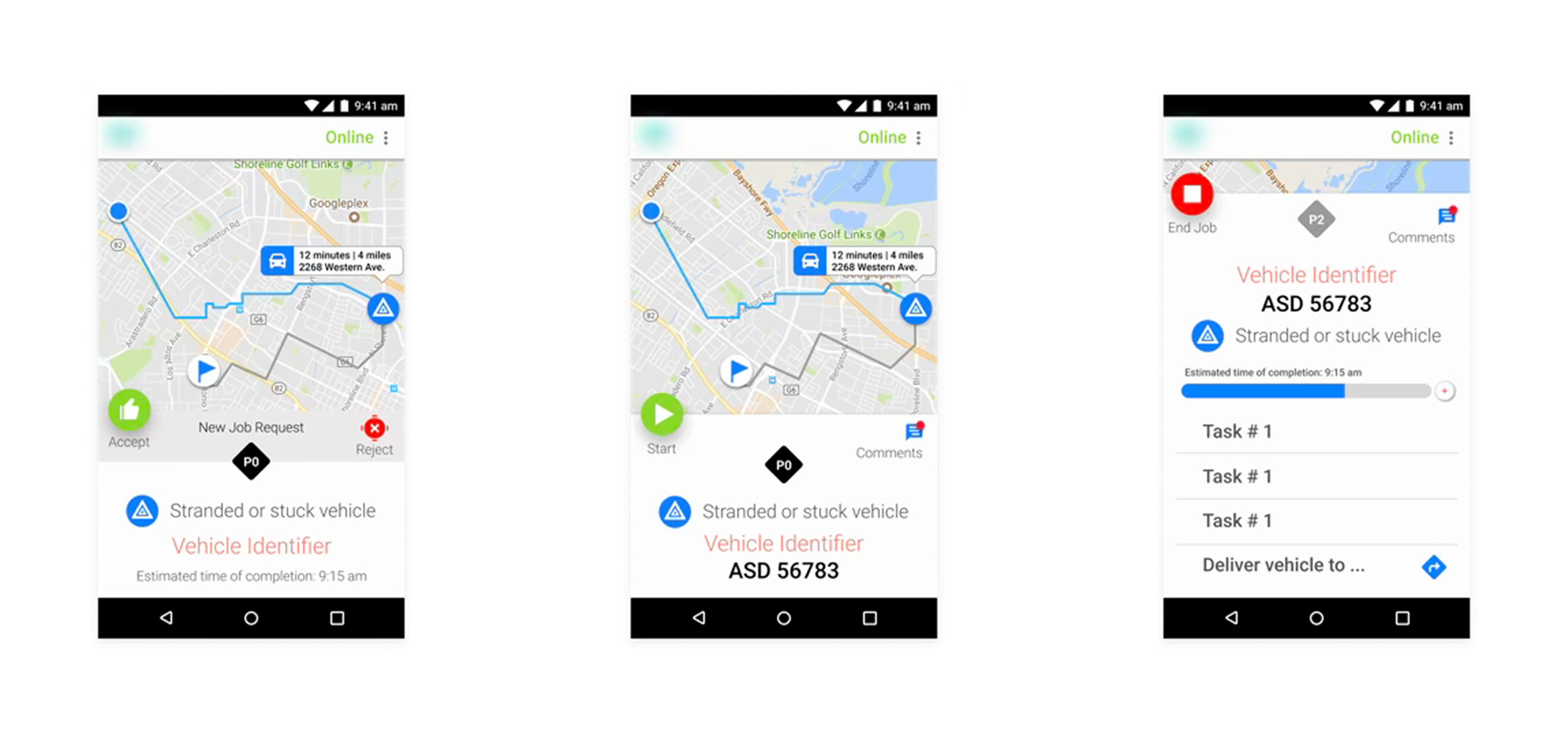
After deploying the beta, we received feedback from the customer regarding several pain points that we hadn't observed in our internal testing.
To better understand our customers' feedback and produce actionable improvements, I planned a contextual inquiry study and spent time riding along with our customers' employees.
From this study, I was able to understand that some of the interactions that we had designed were as optimal for use while driving as we had expected and that the the user flow we had started off with wasn't entirely aligned with the field employees' actual mental modal.
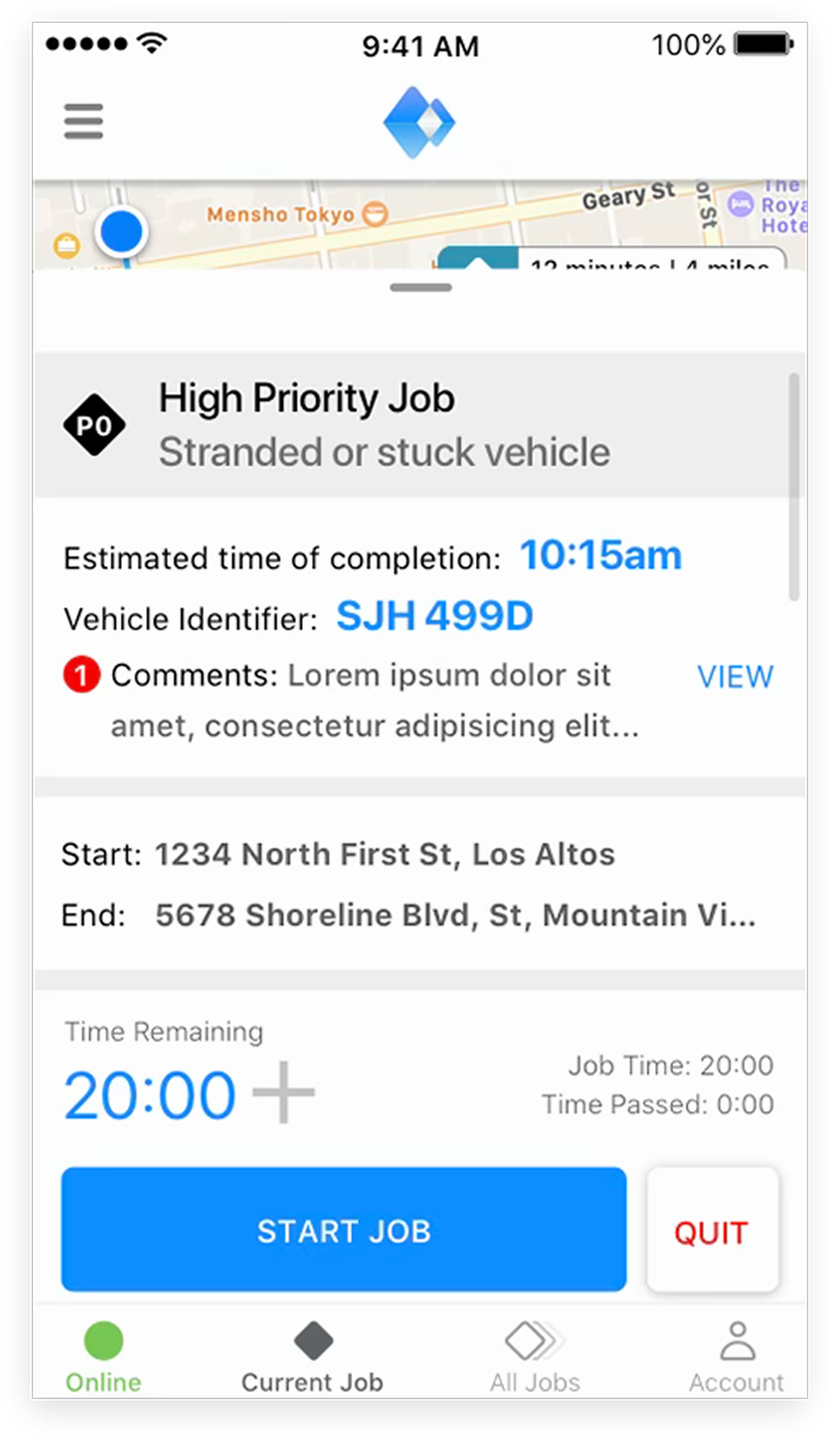
I brought the feedback to our team, and we made modifications to the UI to prioritize information and action while cutting back on of animations and interactions, and we made adjustments to the copy and flow to better-align with the target user's mental model.
This, along with enhancements to our existing webapp informed by contextual inquiry with another customer, eventually led to the launch of Ridecell's Fleet Operations platform.