[Insights and analytics] is evolving into [Engagement Dashboards]!
Over almost four years at People.ai, my work largely revolved around one question: "What does 'good' look like?"
In 2018, the People.ai experience initially comprised of three views based on our customers' email, calendar, and CRM data to provide performance and pipeline data around one simple hypothesis: more activities means more engagement, leading to more success.
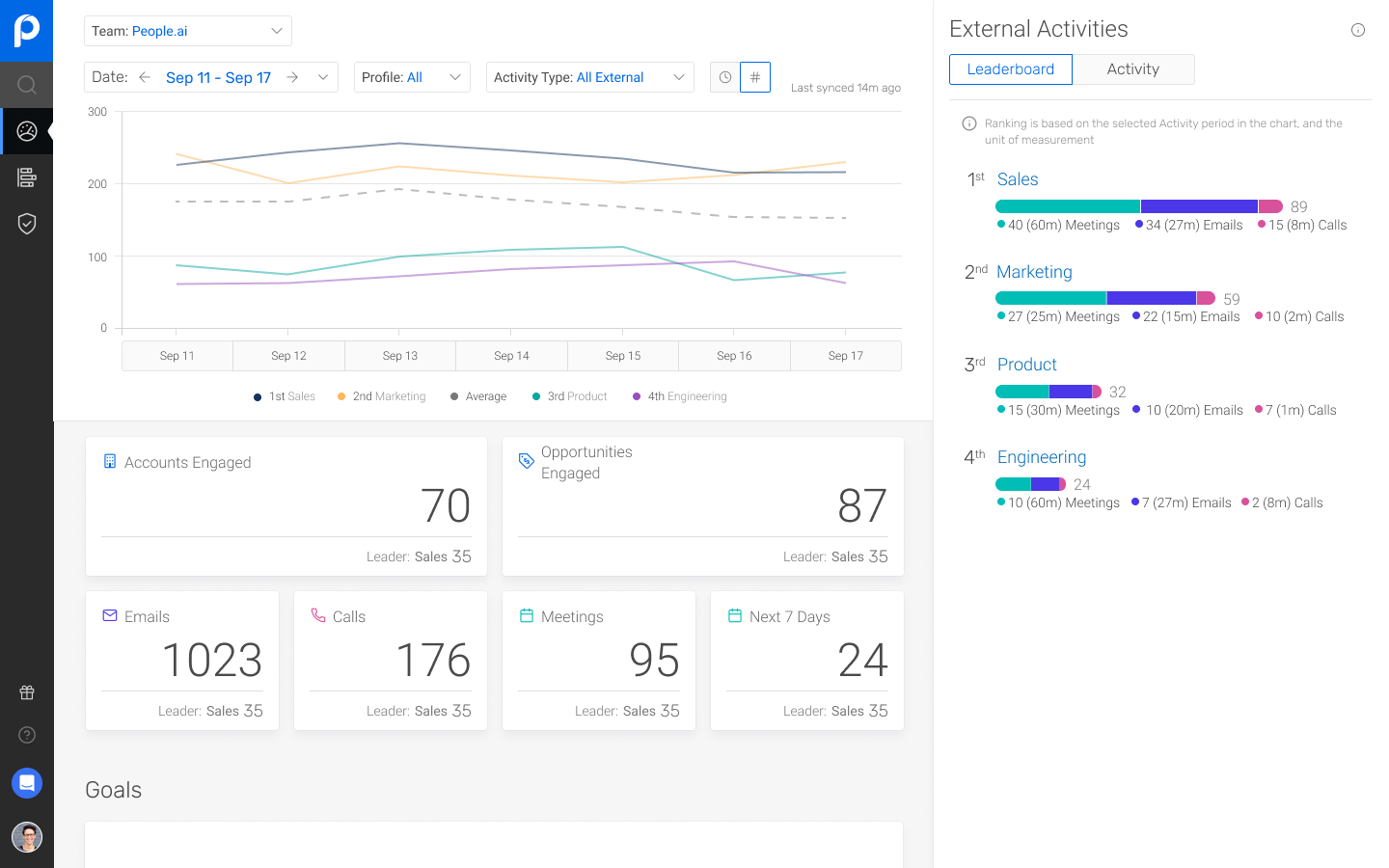
Insights summarized sales rep activities in large billboard numbers for managers to monitor.
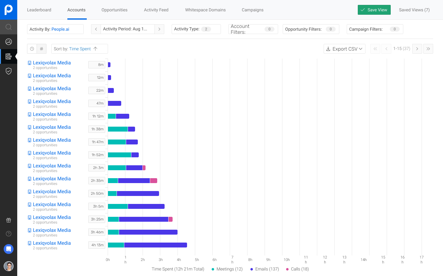
Analytics allowed for additional filtering on the same set of activity data.
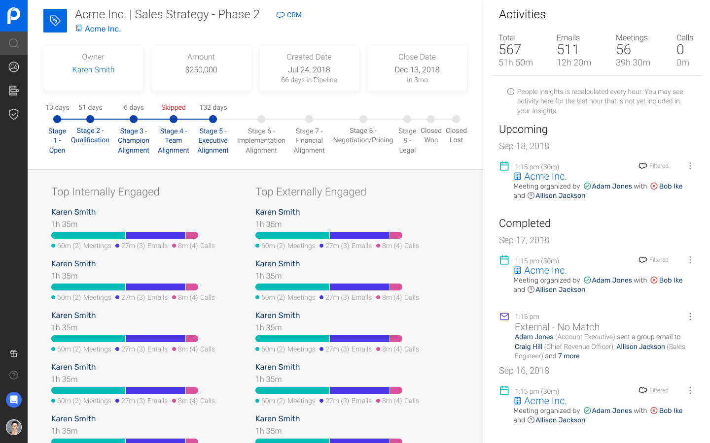
Opportunity Details showed engagement data relative to the people involved in the deal.
Over time, we became more confident in our ability to normalize aspects of our data set and began to explore ways present our customers with richer, more-actionable data.

In 2020, we partnered with five customers to create a new suite of modules targeting front-line sales managers dubbed the People.ai Sales Solution.
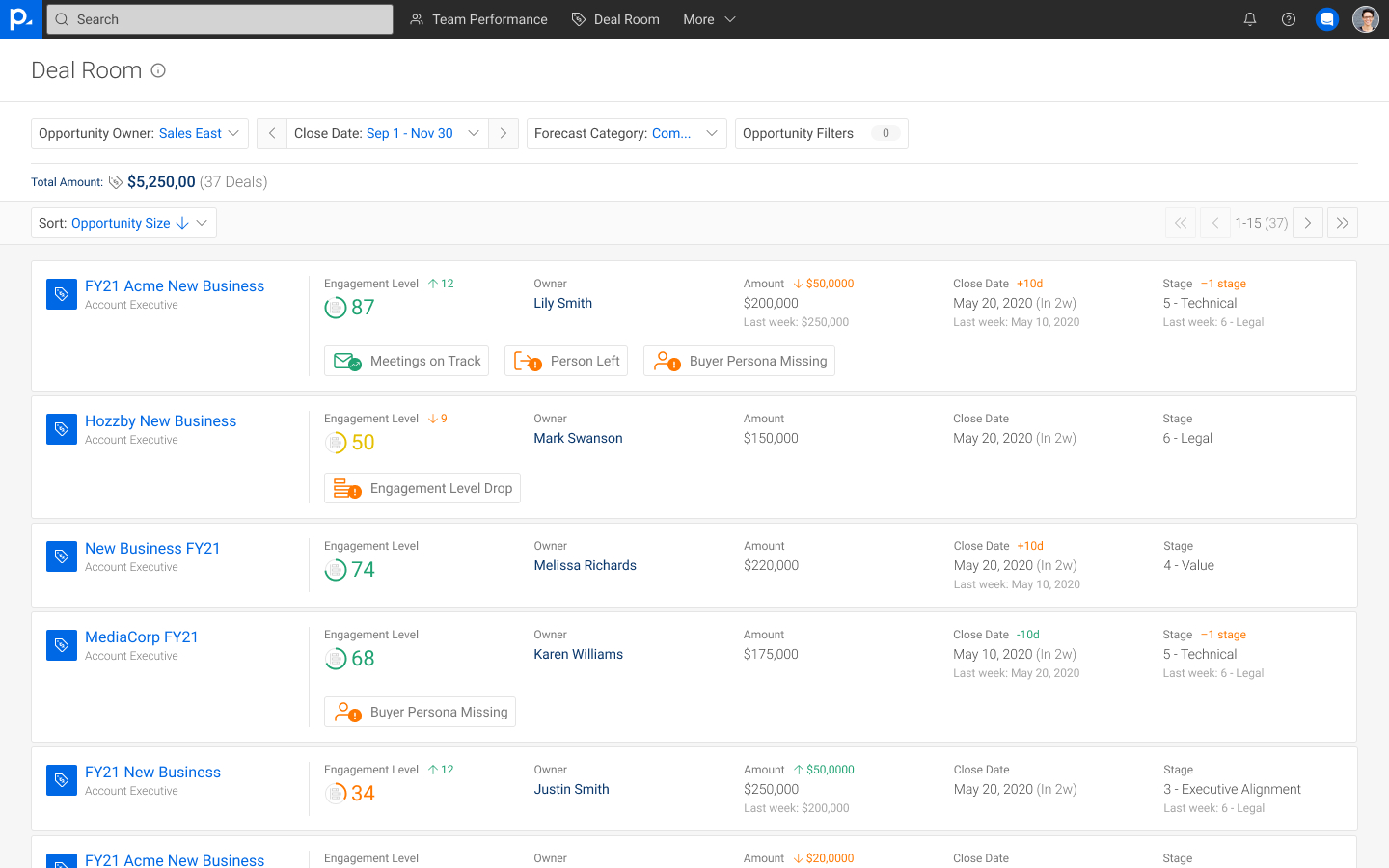
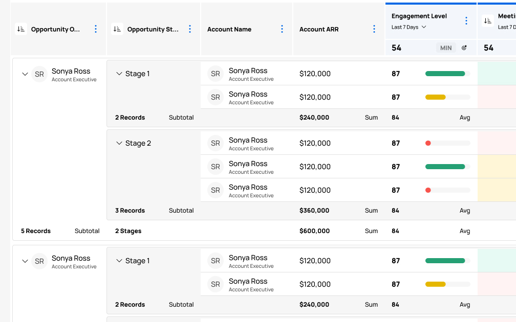
Deal Room showed key data for all of a team's sales opportunities to facilitate a team's weekly deal review process.
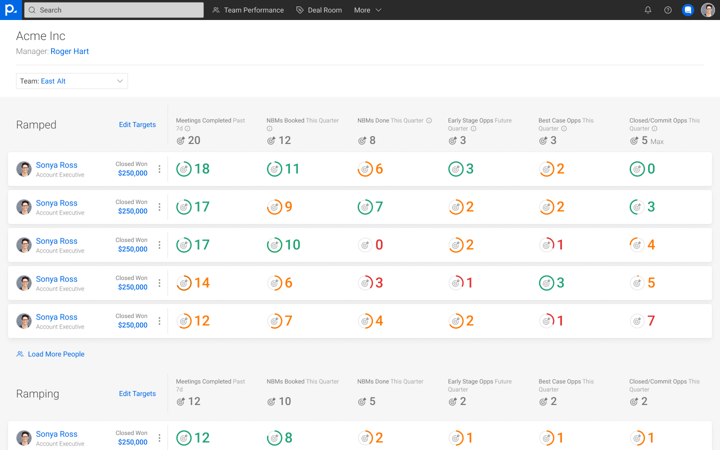
Team Performance allowed a manager to see how their team was performing based on configurable leading indicators.
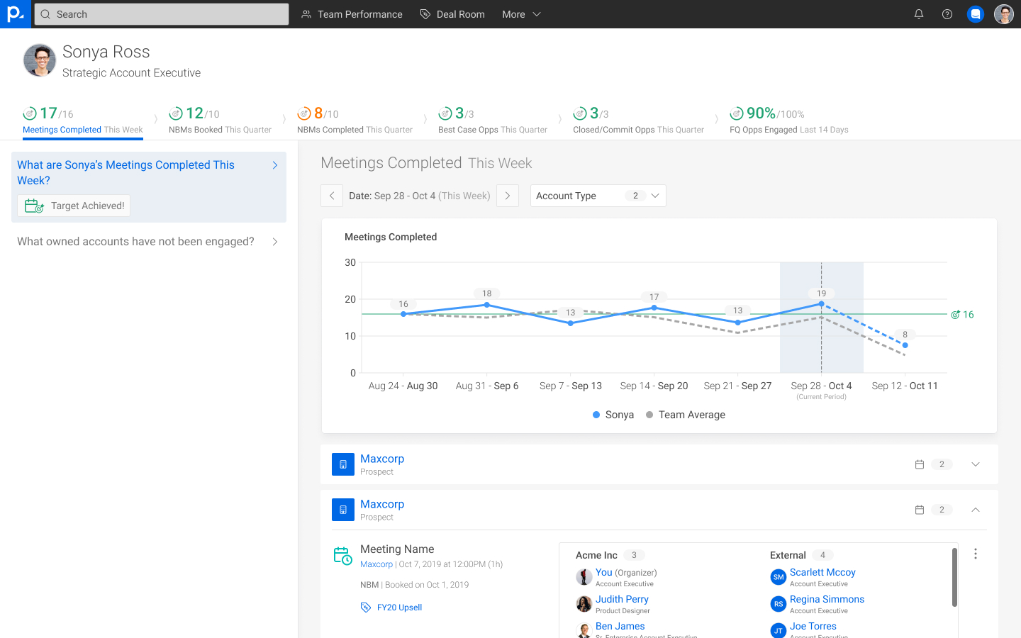
Rep Performance helped managers deep-dive into their reps' performance to improve the coaching experience.
The sales solution showed an increase in weekly active users and in user retention rates.
However, the solution only worked for two personas and for companies that followed the MEDDIC sales methodology.
We couldn't scale this product into new verticals or to address broader parts of the GTM organization.
In the summer of 2021, two Product Managers, our VP of Product, and I spent many days in a WeWork brainstorming what the next evolution of the Sales Solution should be.
We drafted new user stories to capture feedback from before and after deploying the Sales Solution.
I started to break down the Sales Solution into modules to see how we could scale the experience.
And when we realized it wasn't working, I zoomed out and from that higher-level view we came to a realization.
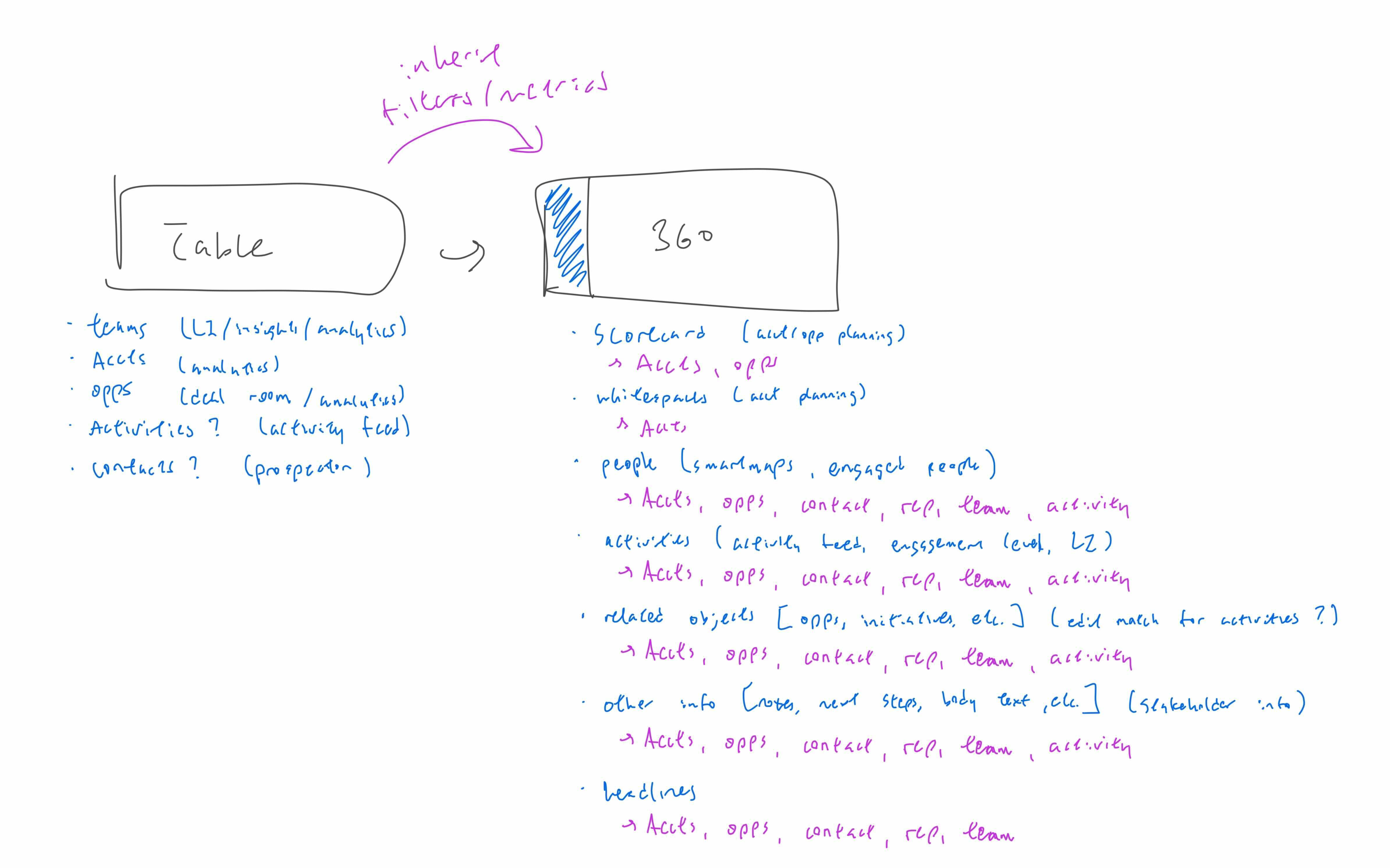
At its core, our product was simple: data tables were just data tables, and detail pages were just detail pages.
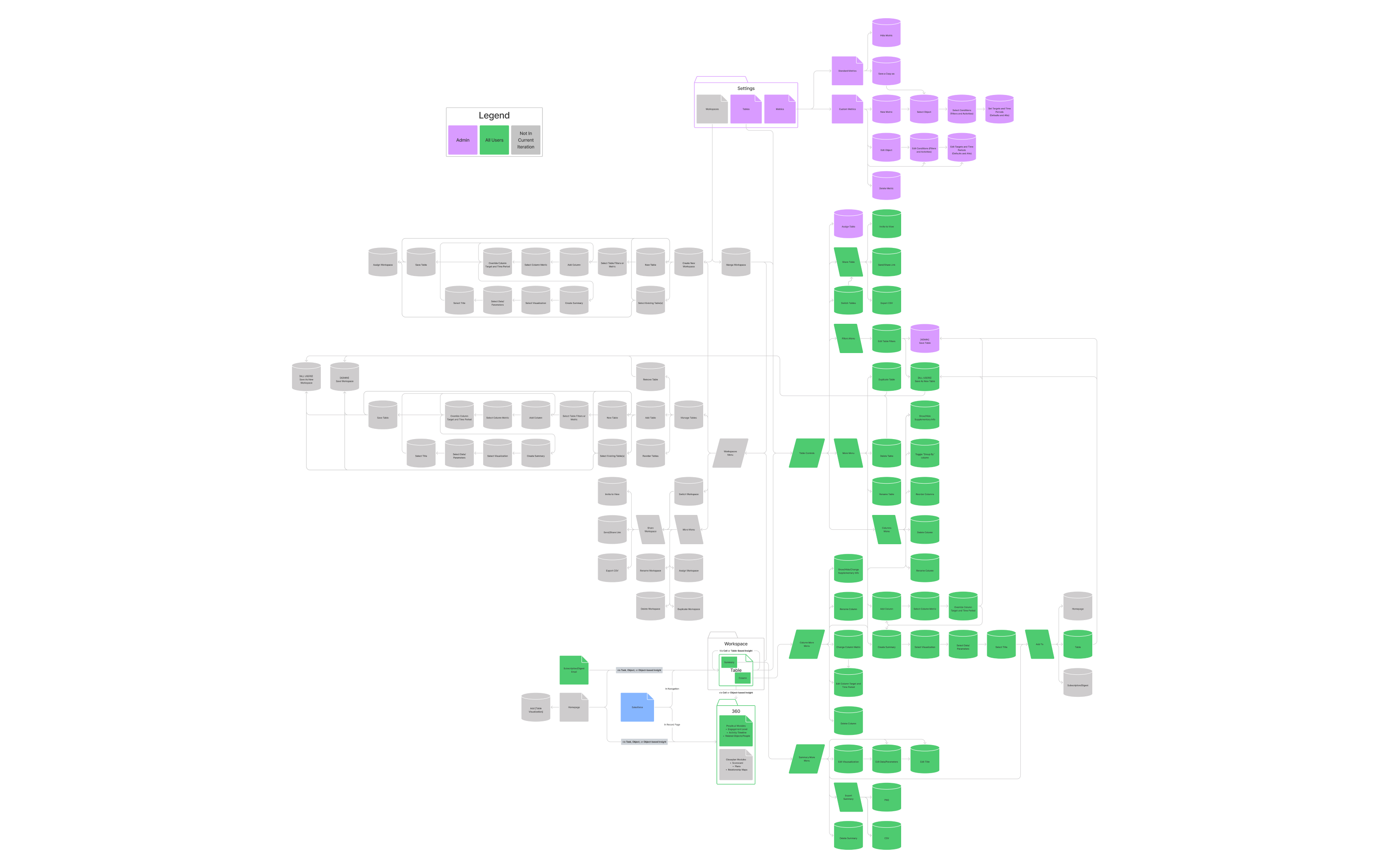
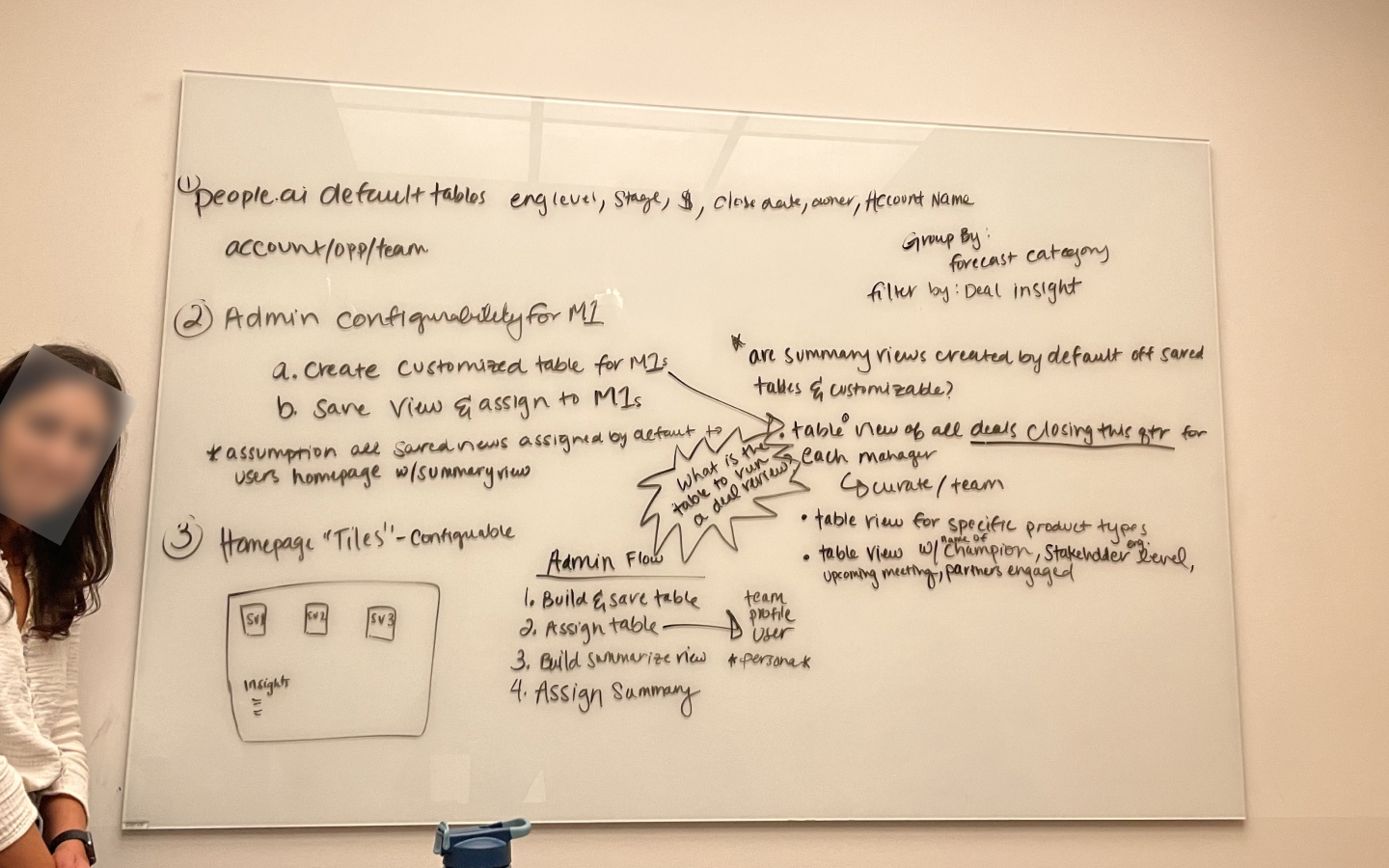
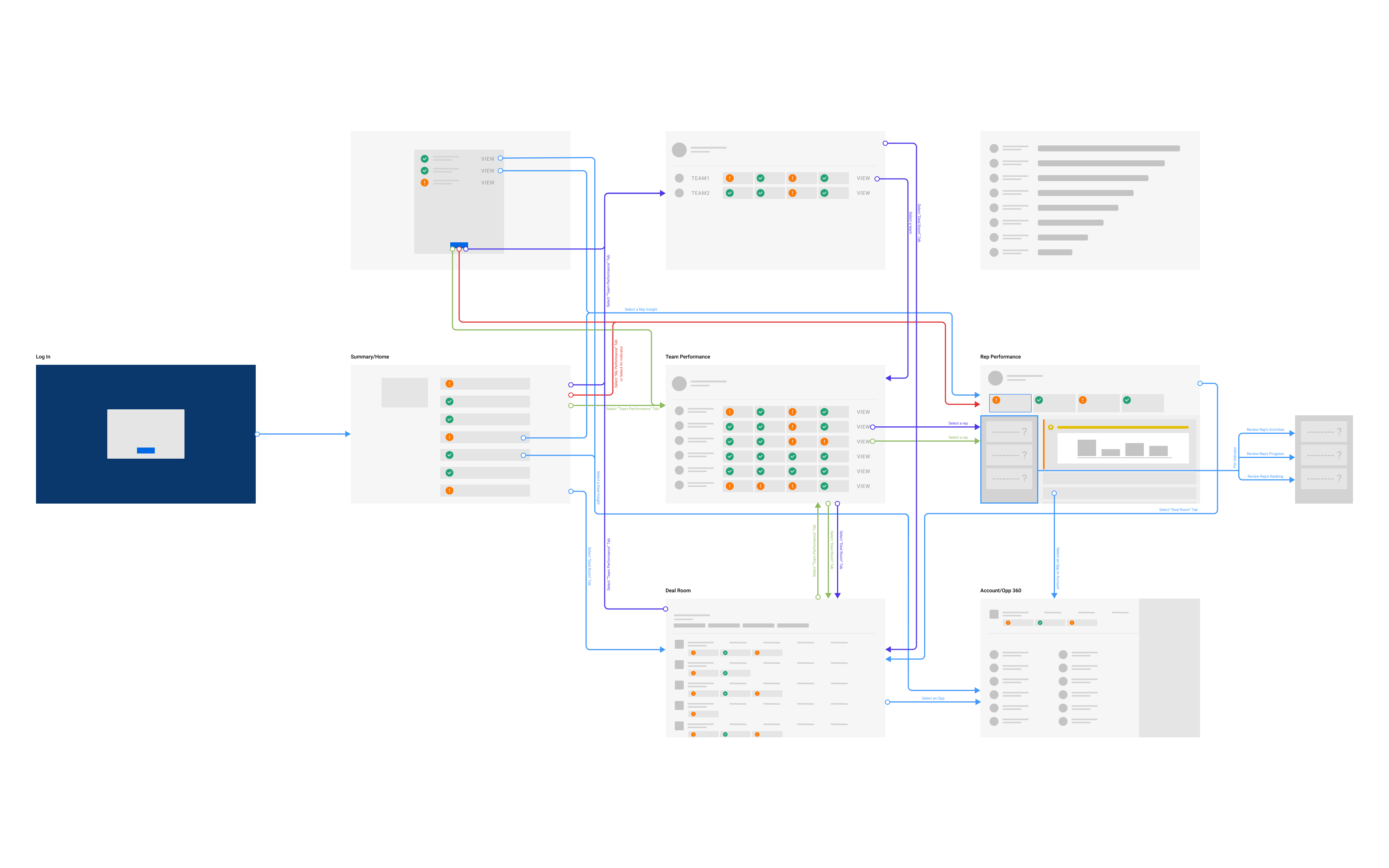
With a new concept and with buy-in from leadership, I began working with Engineering to map out our user flows and information architecture against the back-end system design.
And from this, we created the Engagement Dashboards. A completely flexible reporting solution where we could still work with our customers to guide them toward "what good looks like" while also giving our customers the flexibility to define their experience for themselves.
Over the span of eleven months, we went through three major revisions (and hundreds of iterations here and there) and countless internal and external interviews.
We continued to shape the concept and its scope in partnership with Engineering while evolving our design language.
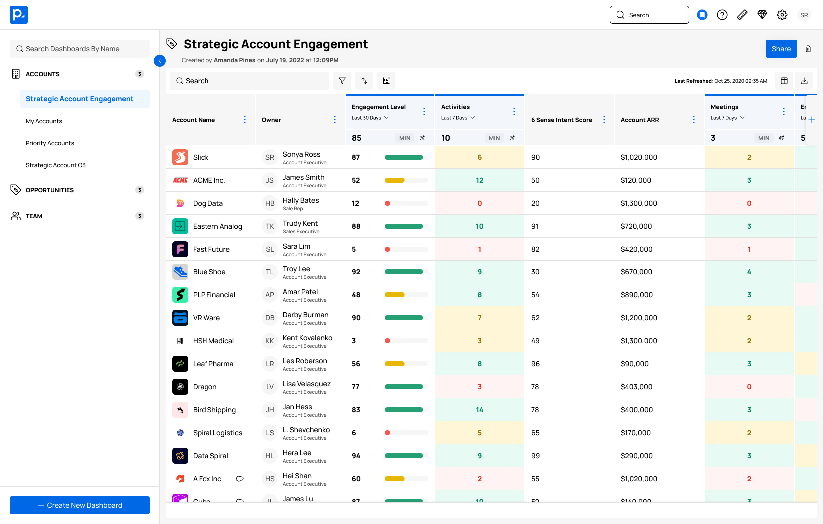
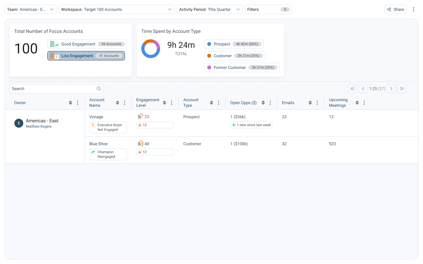
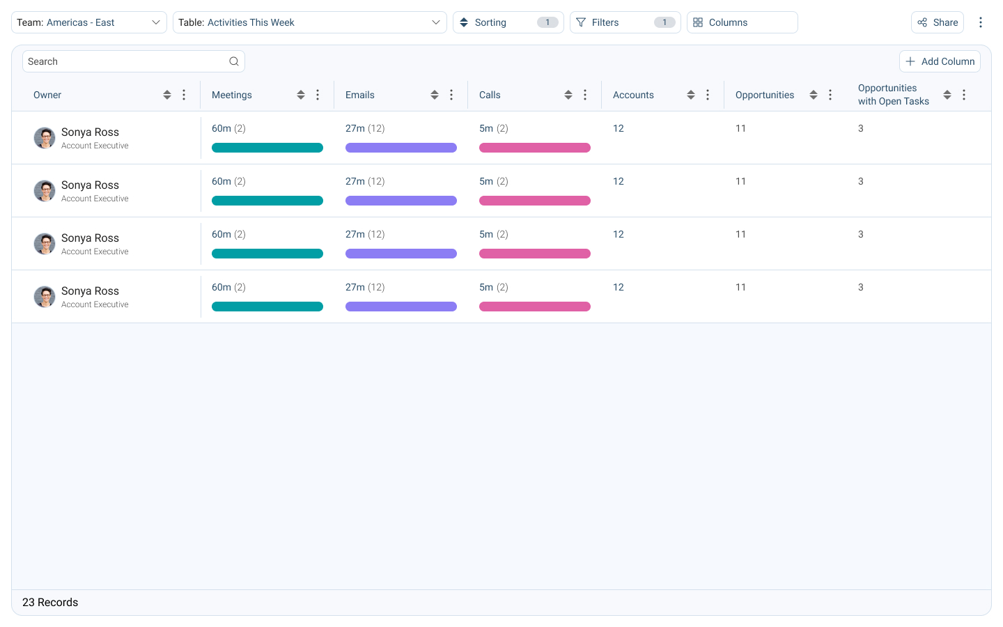
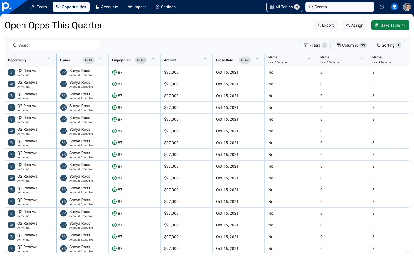
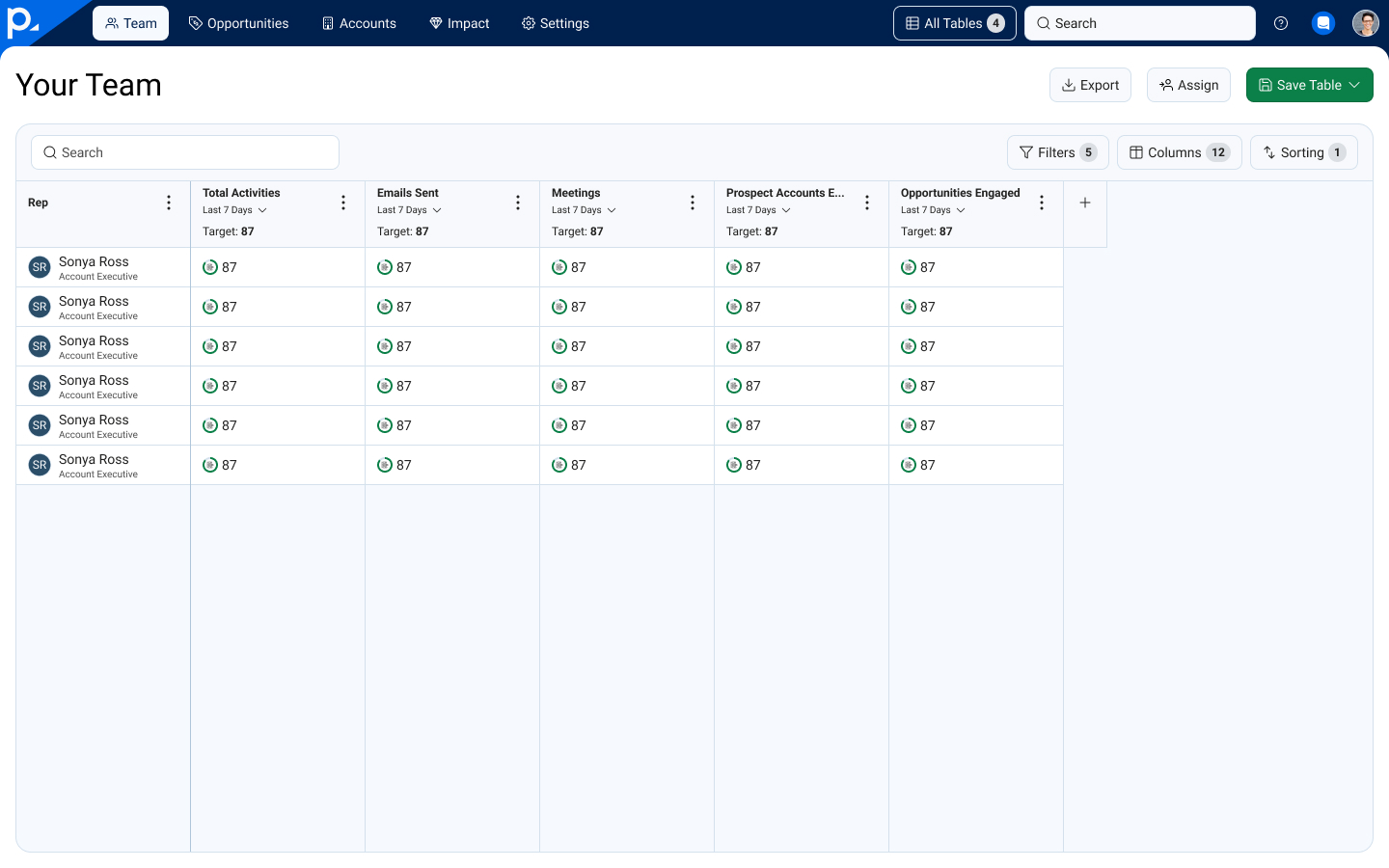
The Engagement Dashboards were designed to be extensible beyond the Team Performance and Deal Room views. A customer could specify custom columns of data that they wanted to track for opportunities or team members, and we expanded the functionality to include accounts for customer success use cases.
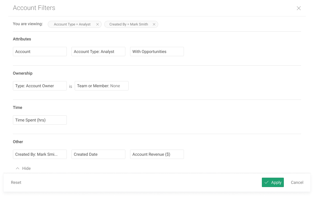
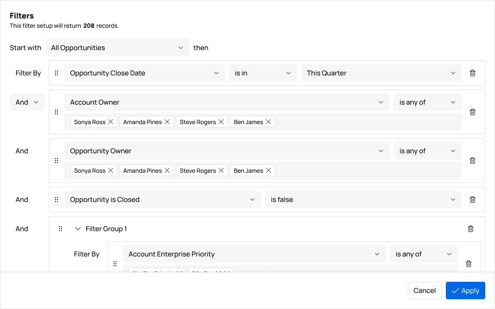
The filtering experience in the previous Analytics view showed the user all of the possible filters with no clear logic, so we redesigned it to allow for increased complexity and clarity while maintaining familiarity.
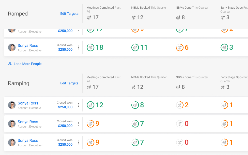
Previously, only sales reps could be grouped by their ramping status. In changing to a more generic table layout, we leveraged grouping paradigms common to other tools, letting us extend this functionality while increasing flexibility.
The Engagement Dashboards' architecure was also designed to extend across the full end-to-end experience, regardless of data type, workflow, or user persona.
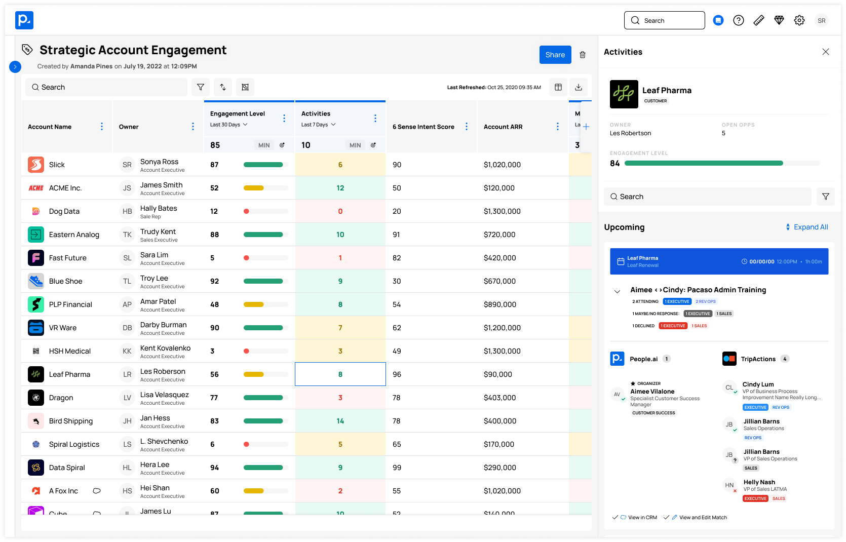
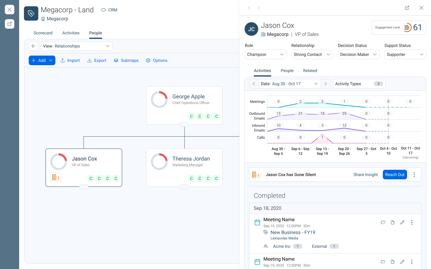
To improve the details pages part of the experience, we wanted to focus on bringing details into the workflow in context rather than throwing the kitchen sink at the user.
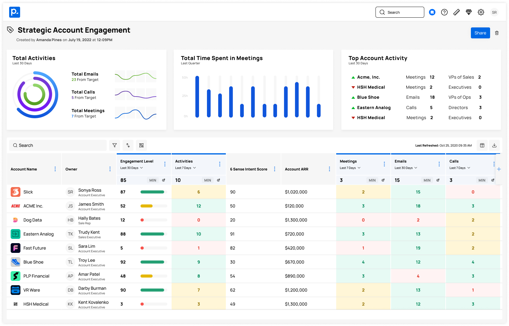
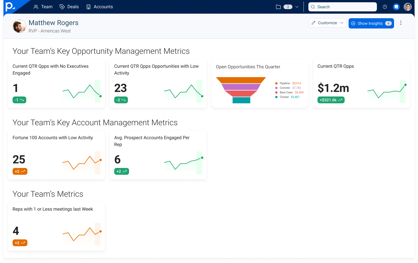
To address consistent themes from our research around leadership personas, we planned to fully develop our initial concepts around customizable and glanceable summaries.