Designing a System to tell the story of Revenue.
People.ai's design system evolved over time to not only support the product's ability to display that data but also enable our designers to focus on more on the users and less on the pixels.
The design system at People.ai never had a name, but I like to call it the "Revenue Design System".
Just as a heads up, there are a lot of very large images on this page.
Version 1: Cohesion
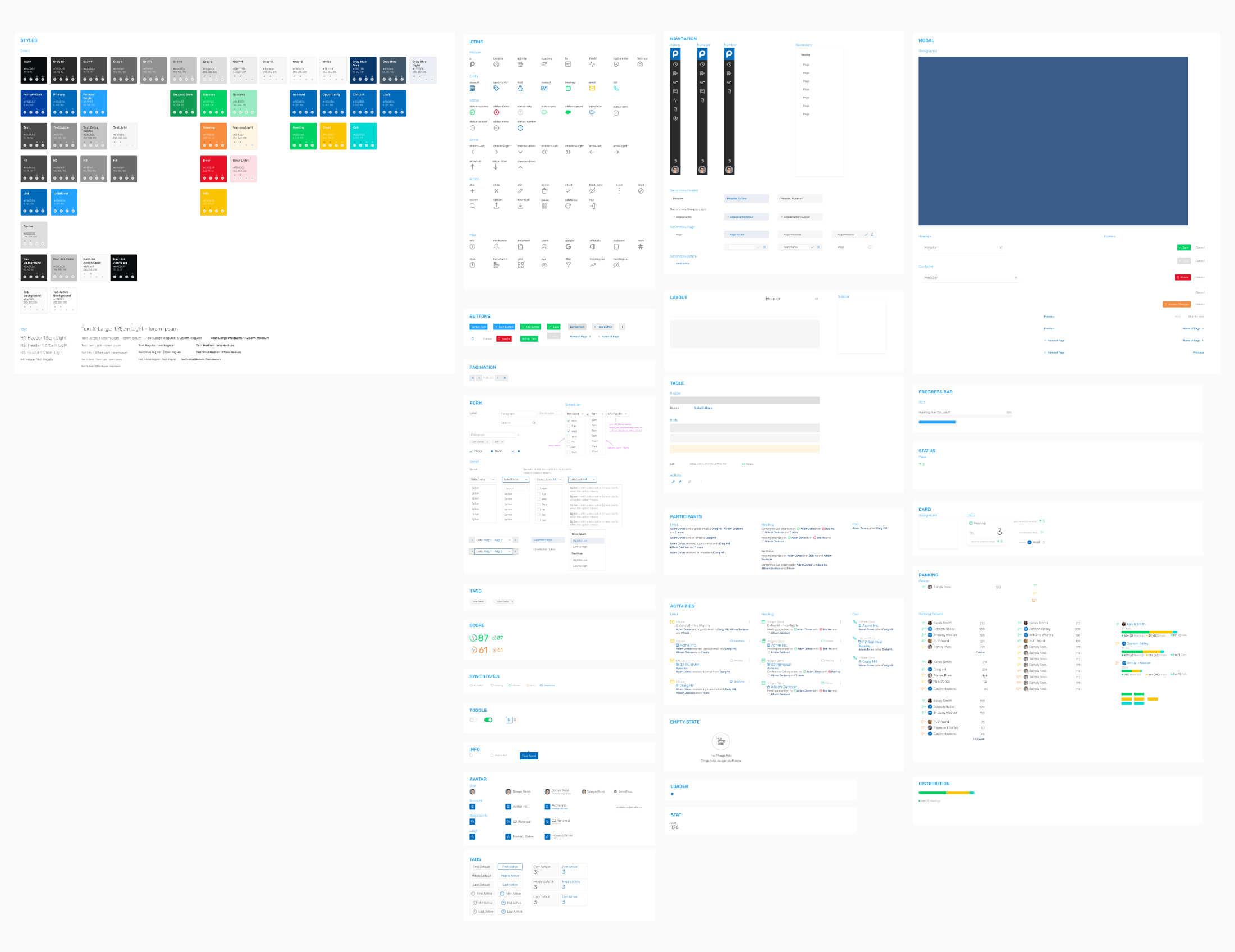
When I joined People.ai, the team had a component library that covered what was in the application that covered various basics based on what was already implemented in the application, but it had some issues with consistency and scalability.
I worked on several improvements to address issues that had come up due to project needs, marketing requirements, and stakeholder feedback. Our component library started to grow to include more components, but there were still areas in which we had no defined rules.
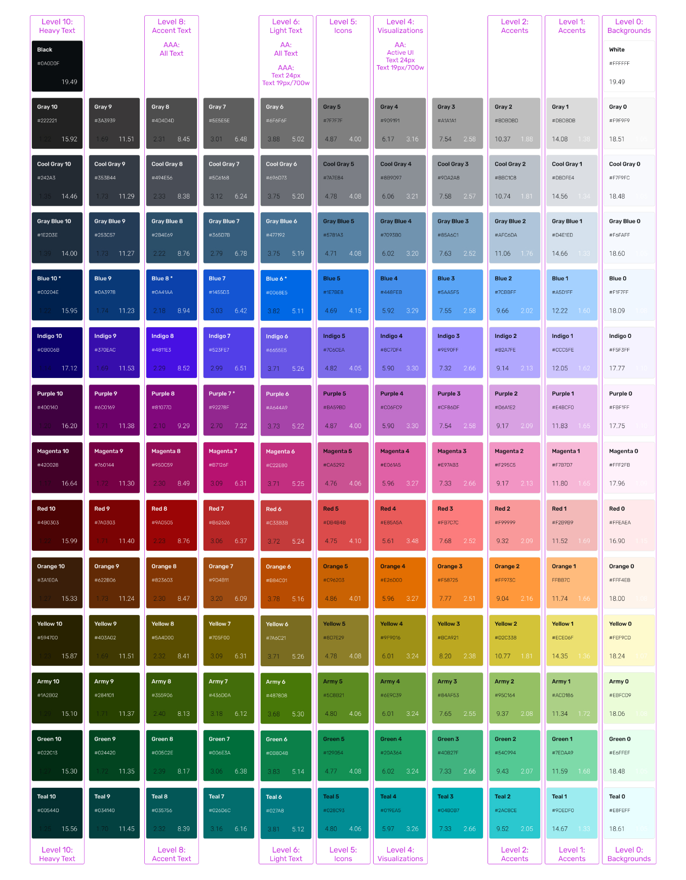
Colors
Our marketing team began to work on a brand refresh, including a new logo and a new identity. Between this and another designer beginning to work on data visualizations, I began working closely with our marketing creative director on a new color system for our application.
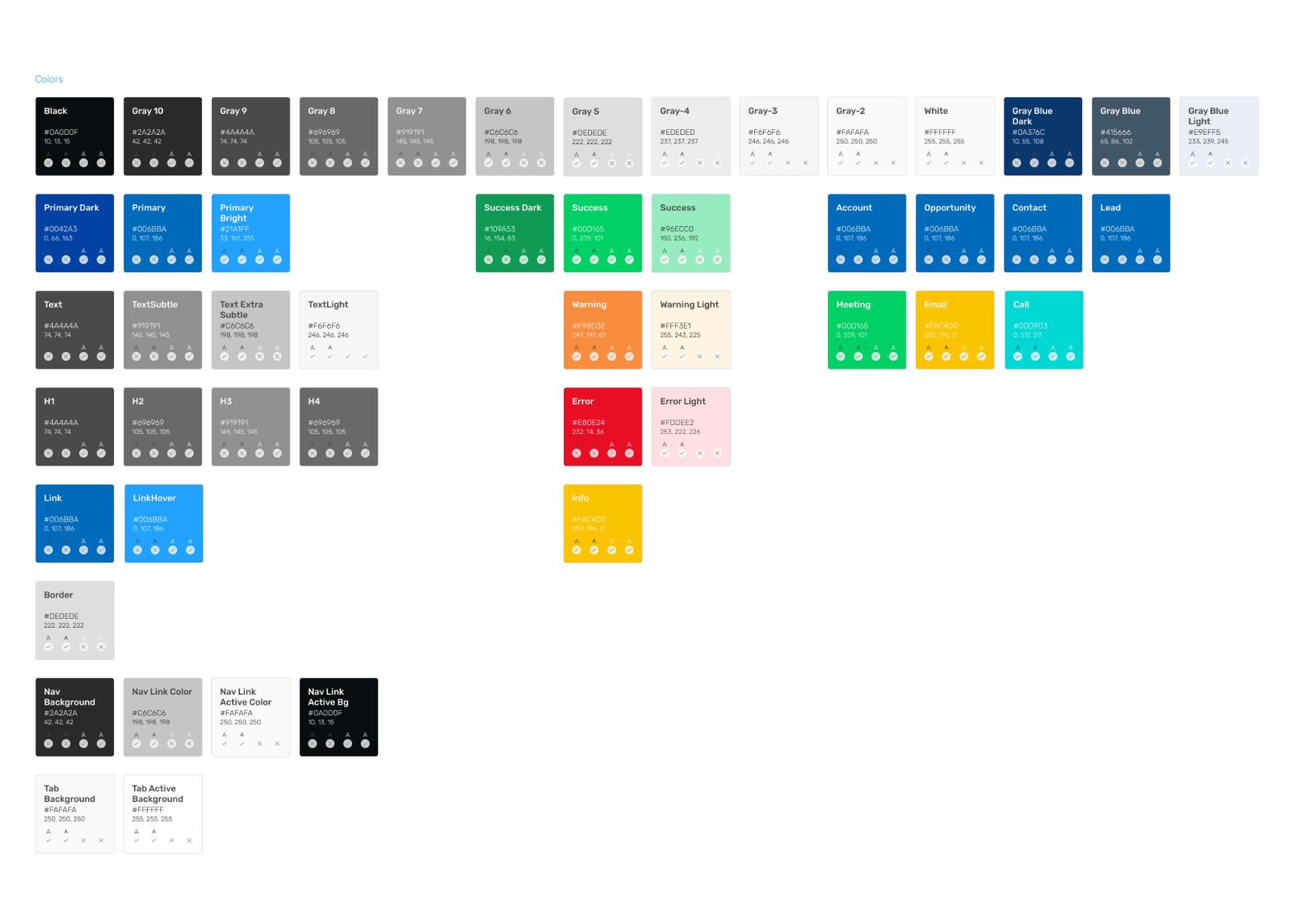
The original color system only contained colors that were already being used in the application. This meant that as new features and use cases popped up, new colors needed to be arbitrarily defined.
To maintain cohesion with the new branding that Marketing was working on, I took the marketing color palette and our app's existing colors to build out a broader set of colors.
Then I tried out several different color ramps. While each object type would have their own shade-based ramp, but we still needed a general set of chart colors.
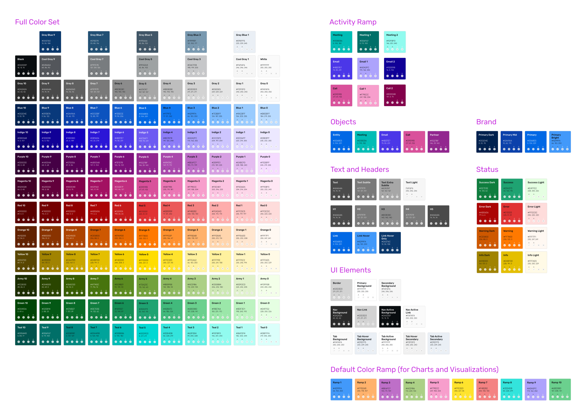
In the process of defining the new colors, we also adjusted some of the other defined colors to help make different app features distinctive.
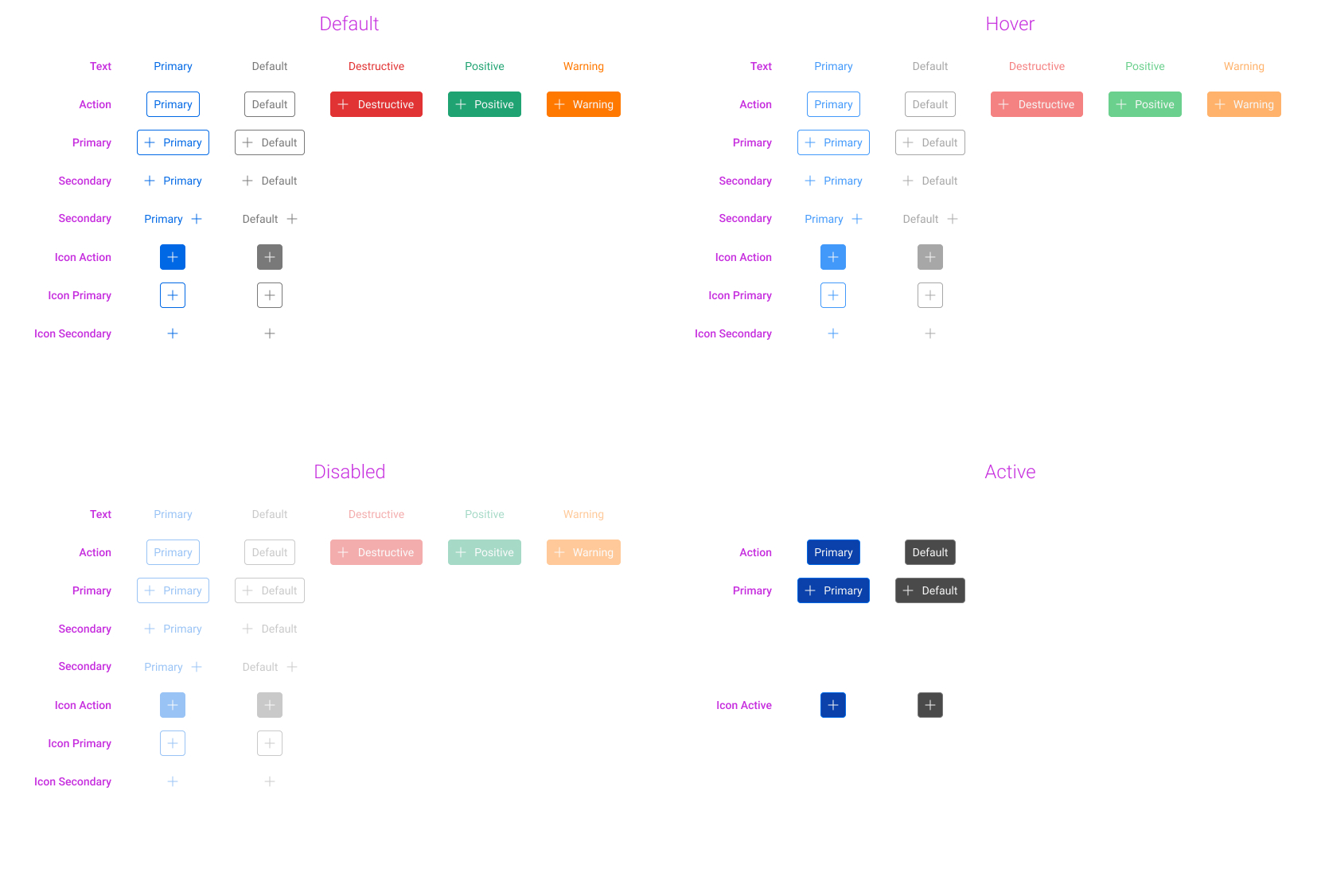
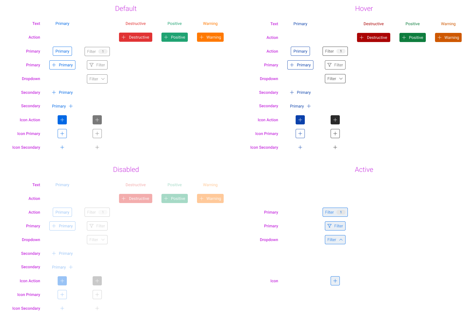
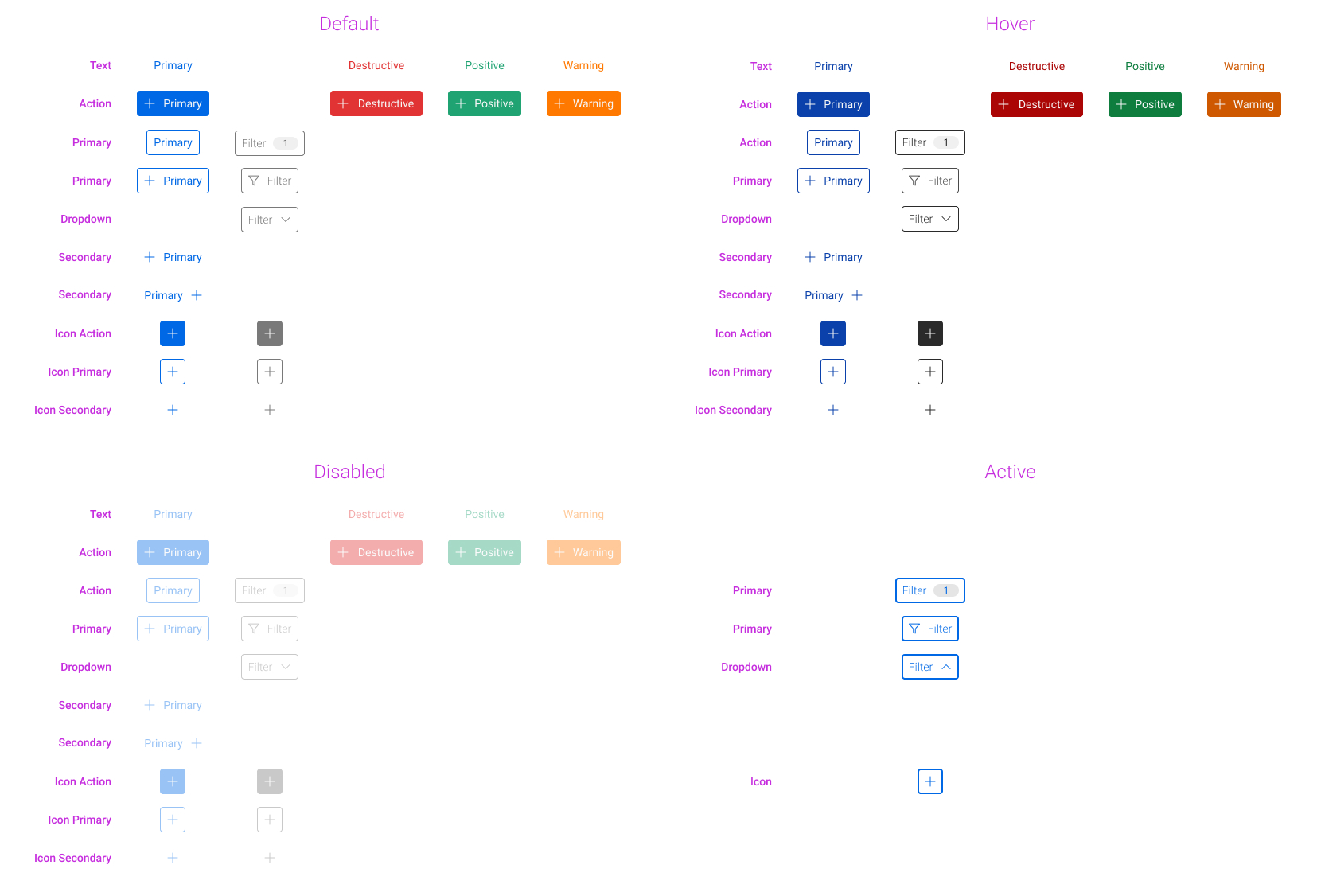
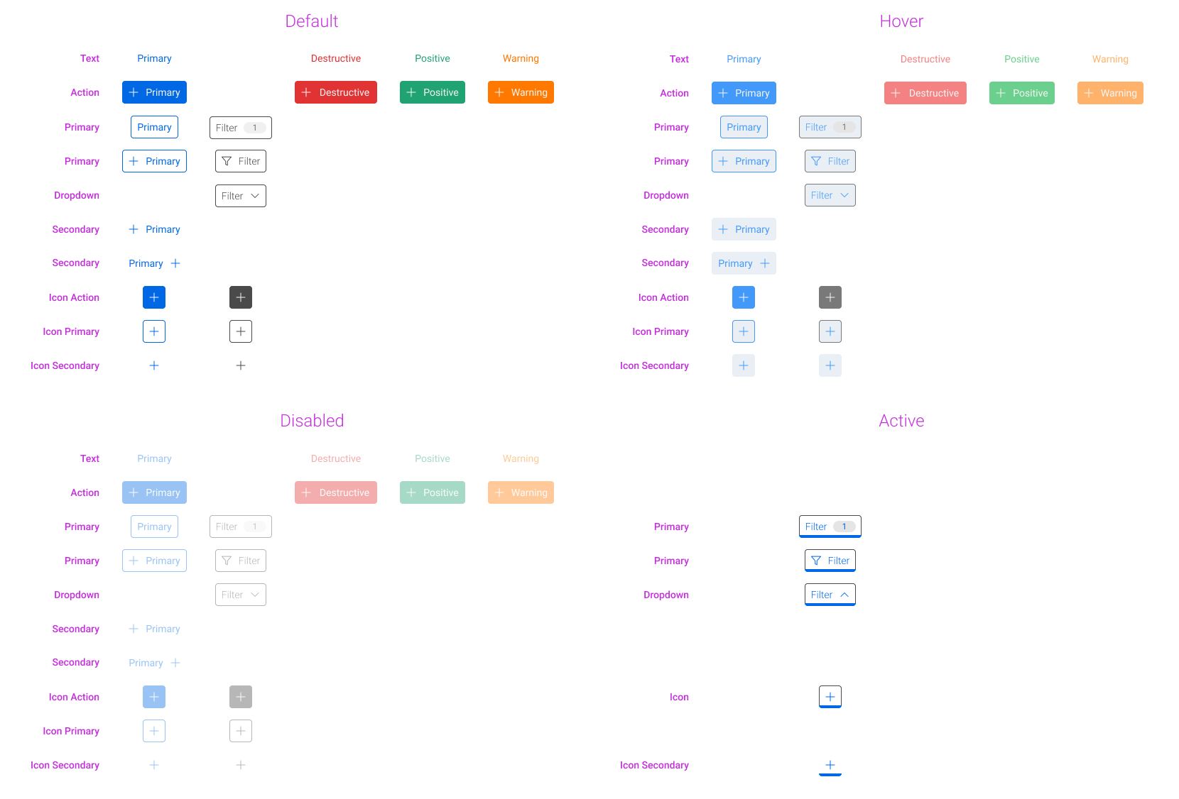
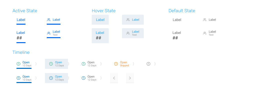
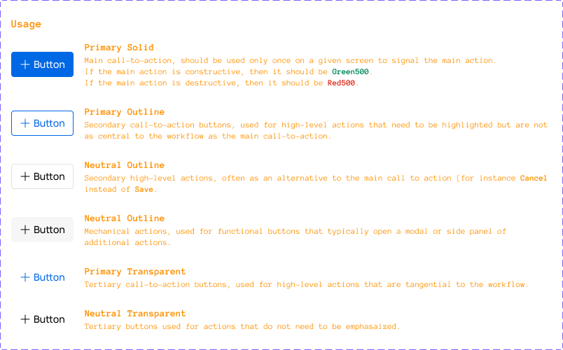
I also took our updated color scheme and used it as an opportunity to have more defined rules and patterns for our buttons. To do this, I went through several different visual treatments for various button styles and states.
Iconography
In response to feedback around our iconography looking unbalanced, I redrew our icons and implemented padding guidelines according to the icon's shape. Our icons also had inconsistencies in stroke width, so guidelines were also created there.
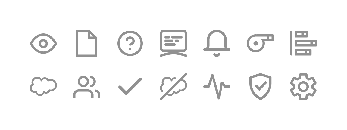
Our icons were 32x32 (versus Feather's 24x24) with a 1px padding regardless of shape. Inconsistent stroke widths came about due to some icons being stretched after being outlined and others being stretched beforehand.
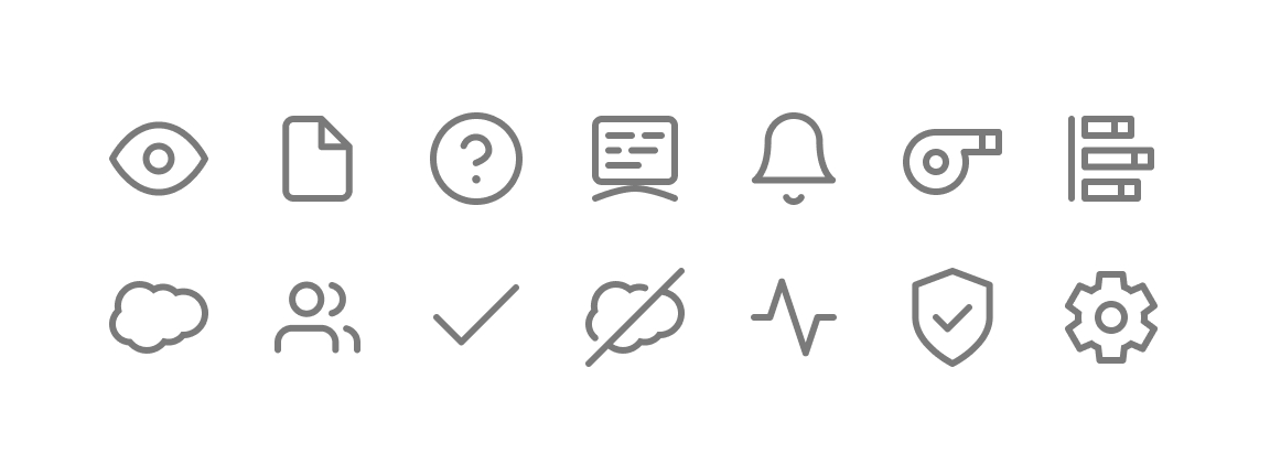
Although I maintained our existing 32x32 icon size, I redrew our icons to always have a stroke width of 2px and to have 1px, 2px, or 3px of padding depending on if the icon was rectangular, circular, or square, respectively.
We also had several instances where our front-end team had further implemented an icon at a different size than it was designed at, so for this effort I worked closely with our developers to make sure that I generated and provided the icons correctly.
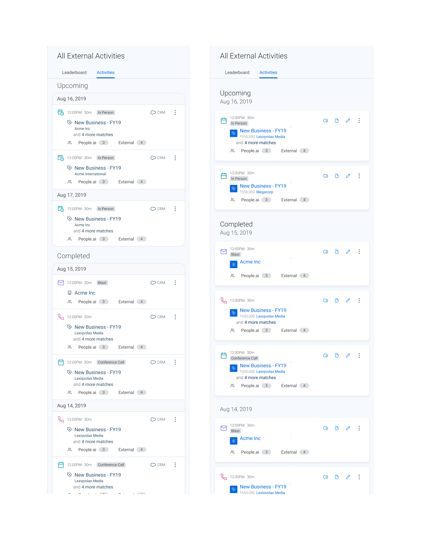
Tabs
We also had feedback, internally and externally, that our tabs didn't look like tabs.
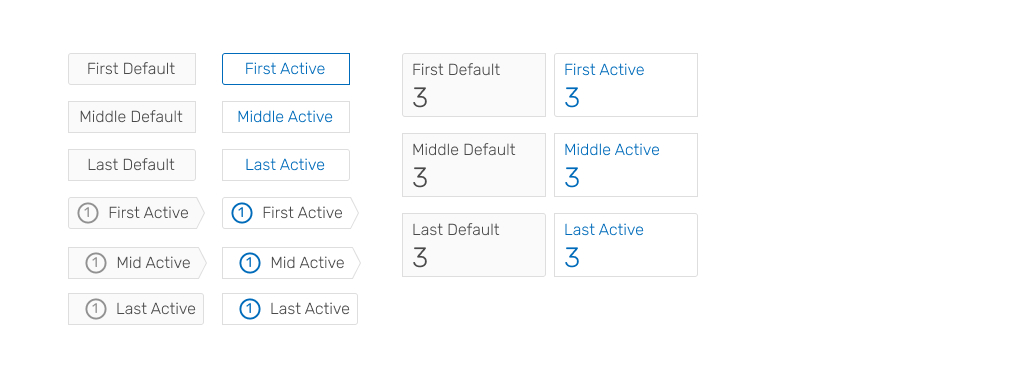
The original tabs were styled like tab toggles, and feedback was centered around the tabs seeming disjointed from the views that they were controlling as a result since they weren't attached to any borders or edges.
Using secondary research, a quick quantitative study, and some qualitative data, I redesigned our tabs to match what users had become accustomed to, including being attached to the top of the tabbed element.
Version 2: Revision
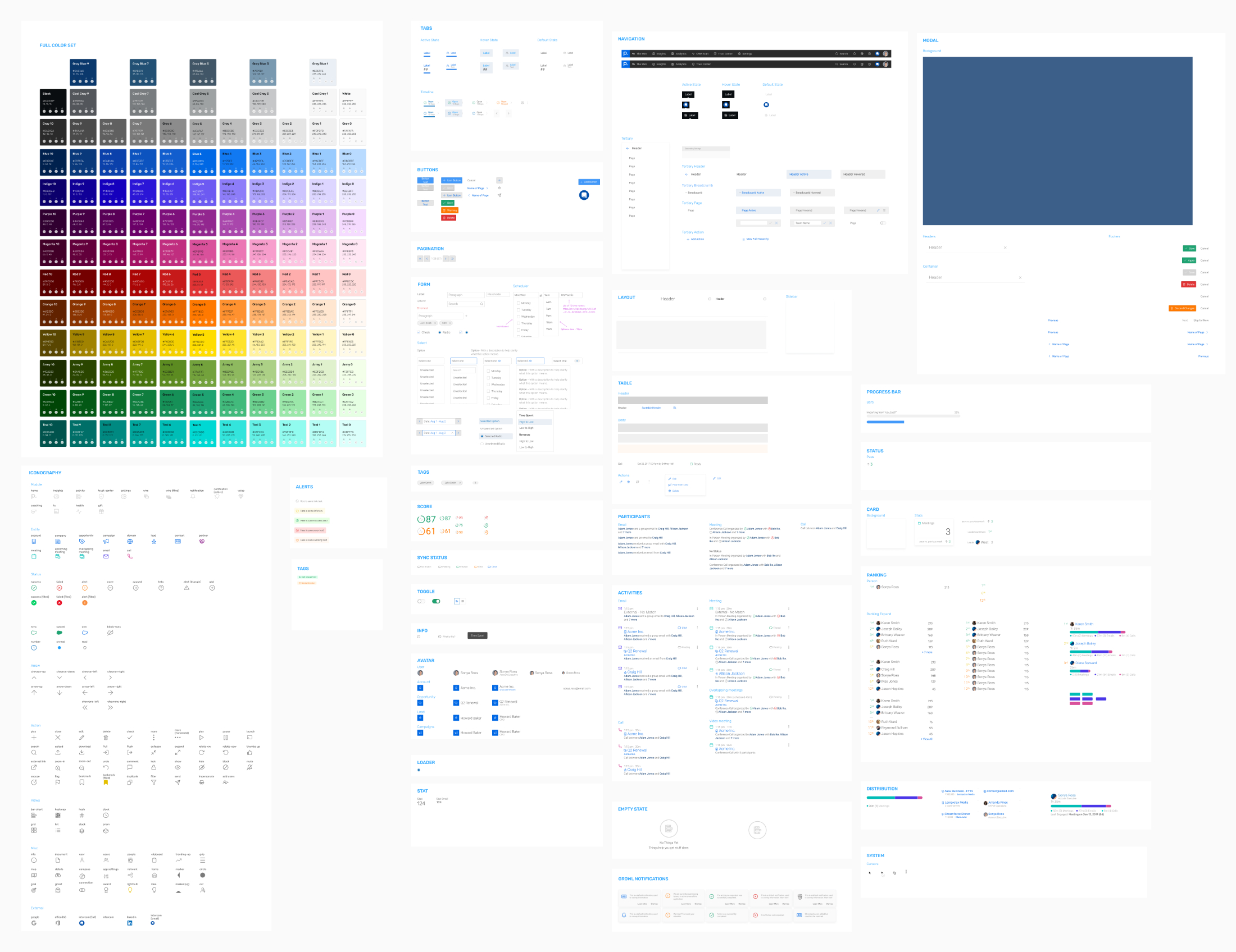
Our design system continued to evolve, and I continued to not only expand our components out to accommodate additional cases and variations but also continuously adopted new features within Figma to improve efficiency.
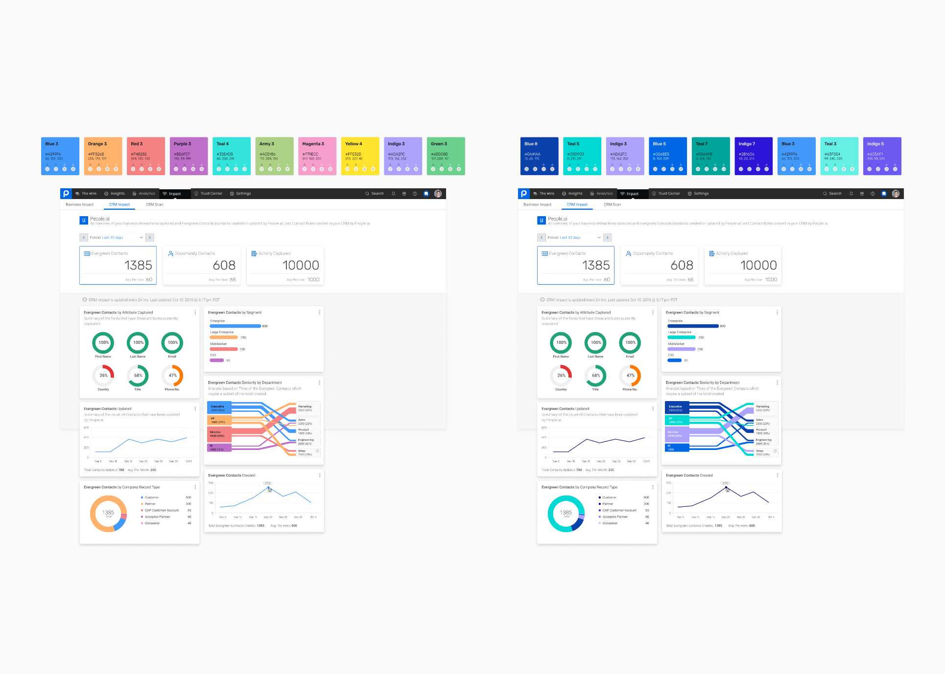
In 2020, we decided as a team to refresh the overall appearance of our application to modernize the aesthetics while also introducing several functional improvements.
Another designer and I approached this refresh from different angles: she focused on incorporating design ideas inspired by B2C applications while I focused on improving the accessibility of our color palette and how the UI reflected the information architecture of each page.
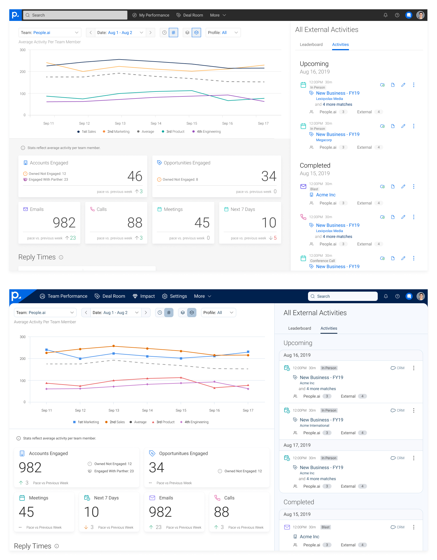
We tried a couple of different variations on major components of our web application. We thought of the activity feed as a major component since it was used in many places and influenced several other components.
One of my own objectives with this refresh was to implement a color system that allowed us to meet WCAG 2.0 AA standards for color and contrast since previously leadership had opted against prioritizing such.
Version 3: Unification
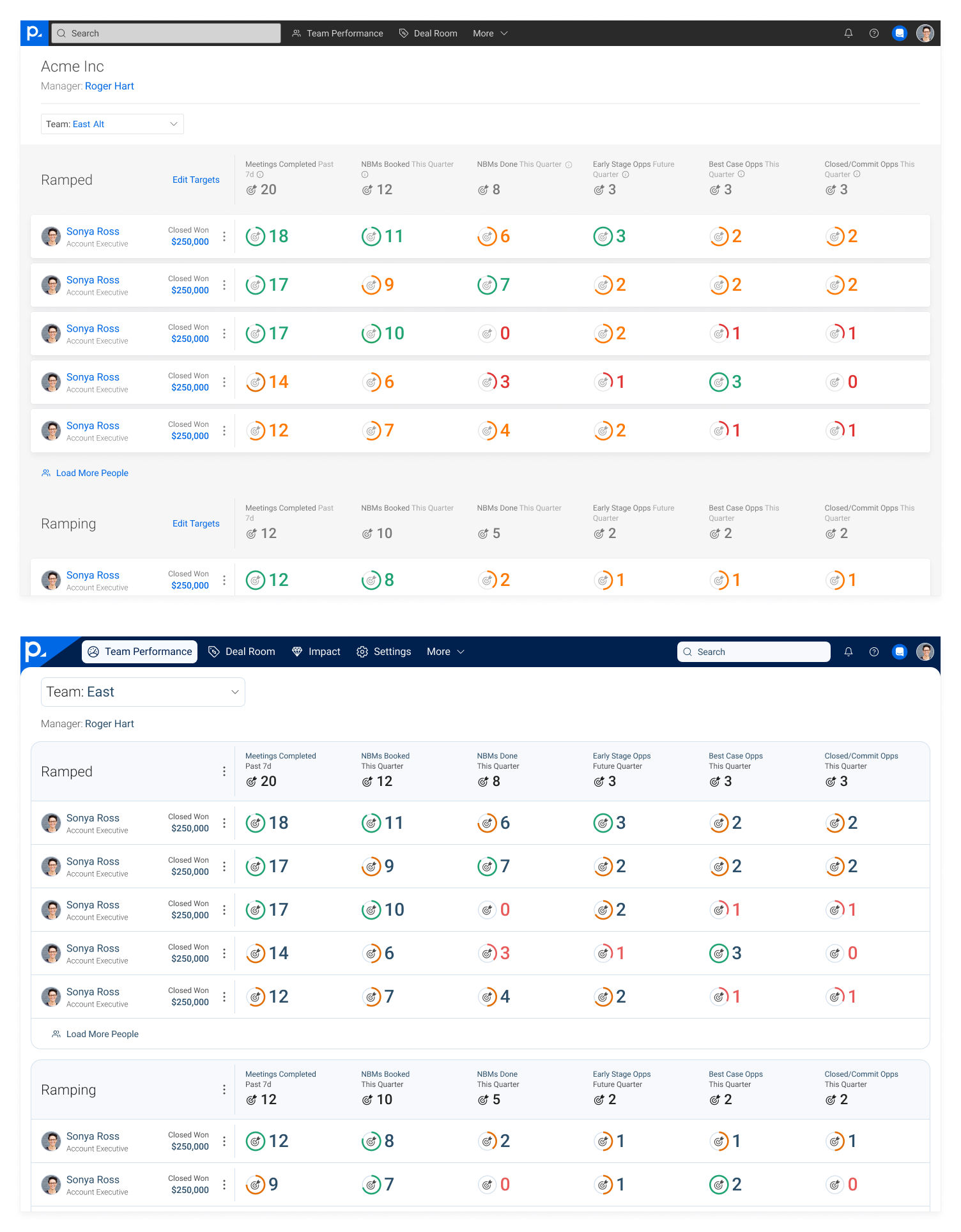
In 2021, People.ai acquired Hero Research. Soon afterwards, we started to work on our Engagement Dashboards project, for which we needed to introduce proper table components to our design system.
We used this as an opportunity to create a new, unified design system.
Prior to deciding to unify our design systems, the designer for Hero Research had already adopted our iconography style and guidelines.
That meant that the bulk of the work came down to adopting a shared color palette, as well as ensuring that our component library could cover the needs of both of our respective products.
Colors
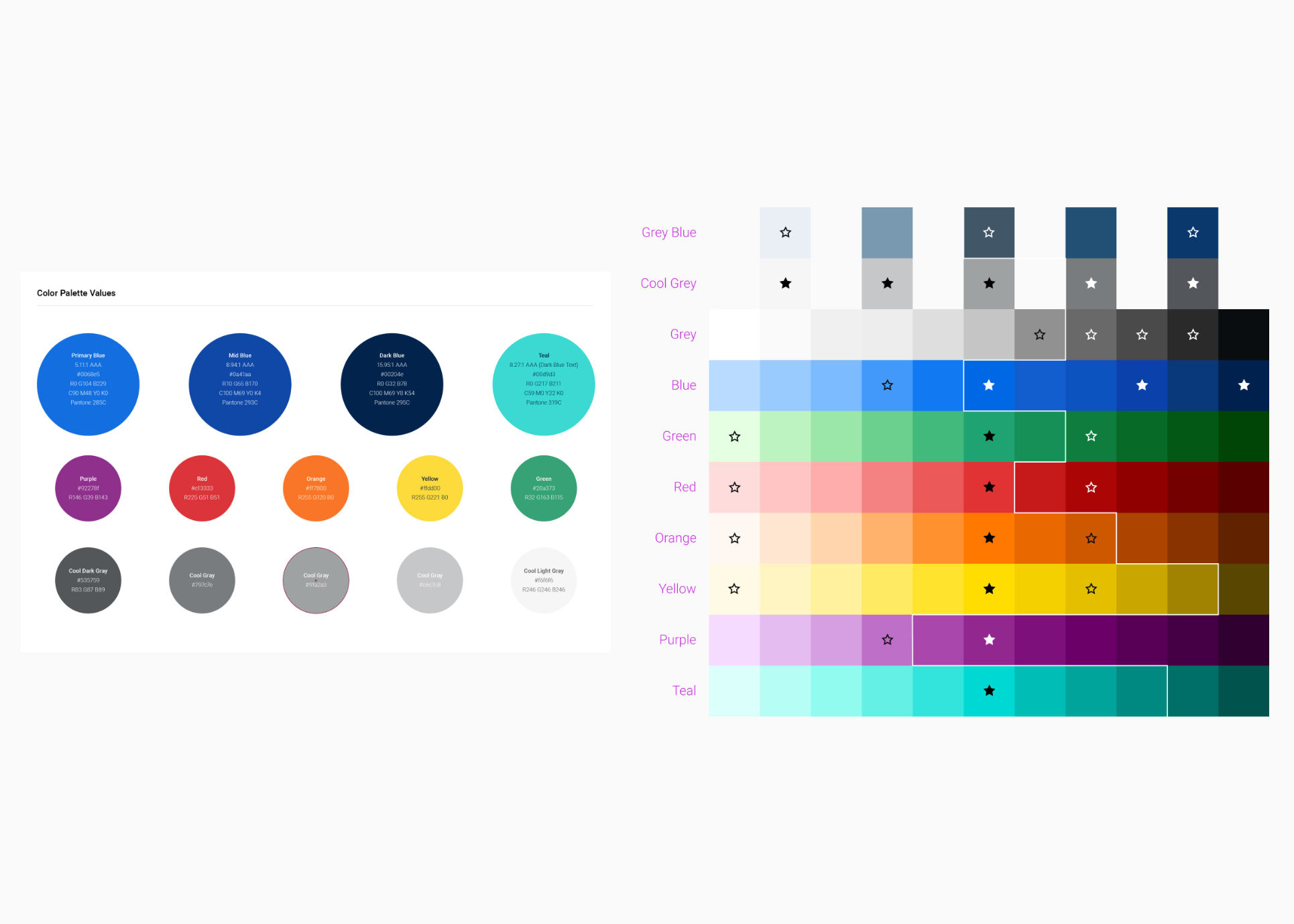
One complicating factor was our CMO wanted to do another brand refresh at the same time we were discussing a shared color palette.
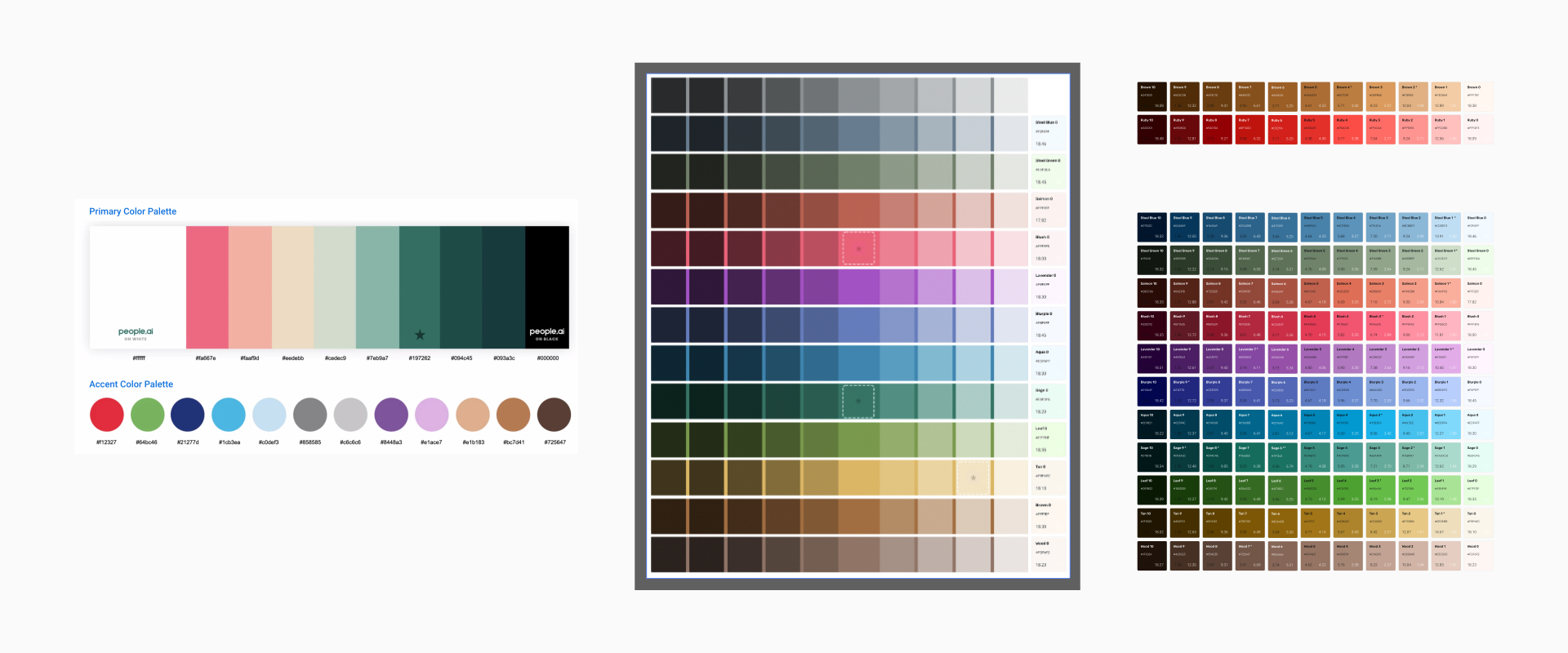
I started off by taking the colors that our marketing's partner agency had created tried to expand them out into a new color palette that would fulfill the product's needs in terms of flexibility and accessibility.
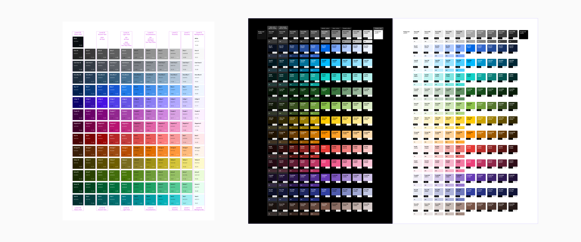
The company ultimately decided not to proceed with the brand refresh, so I started to work on creating a color system that expanded upon our existing system to accommodate Hero's application being primarily dark mode.
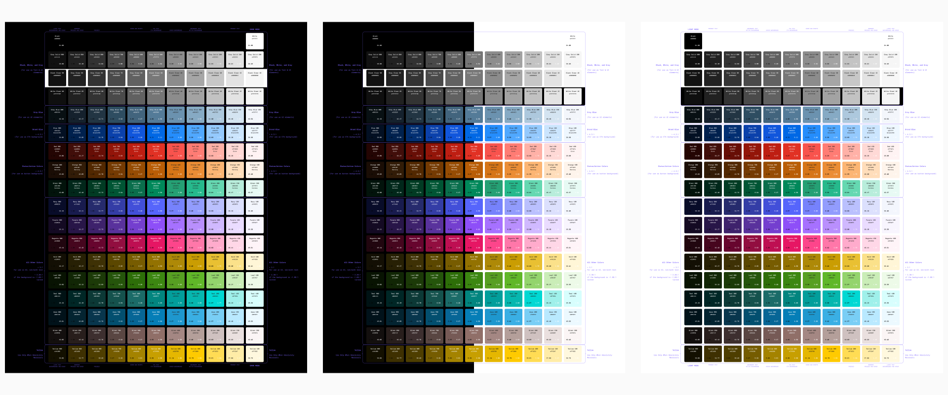
I expanded out the design system to provide enough additional color shades that we could easily switch between light and dark themes while also working with our front end team to make sure that the system worked with the CSS frameworks that they were adopting.
Component Variants
The rest of our library consolidation largely consisted of agreeing on the same sizes, paddings, and corner radii for our components.
I started documenting our component and color usage patterns to help another designer with onboarding, as well as to help communicate our design guidelines to brand partners.
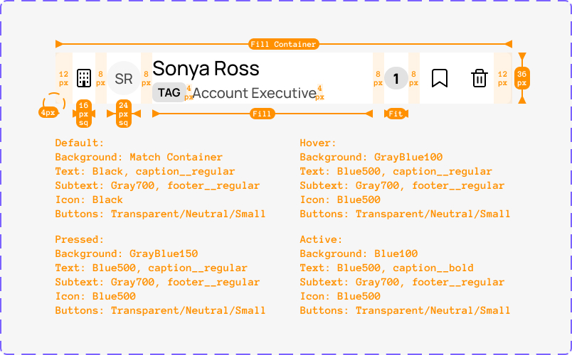
I also worked on breaking down how we sized and padded our components to facilitate hand-off with our front-end teams.
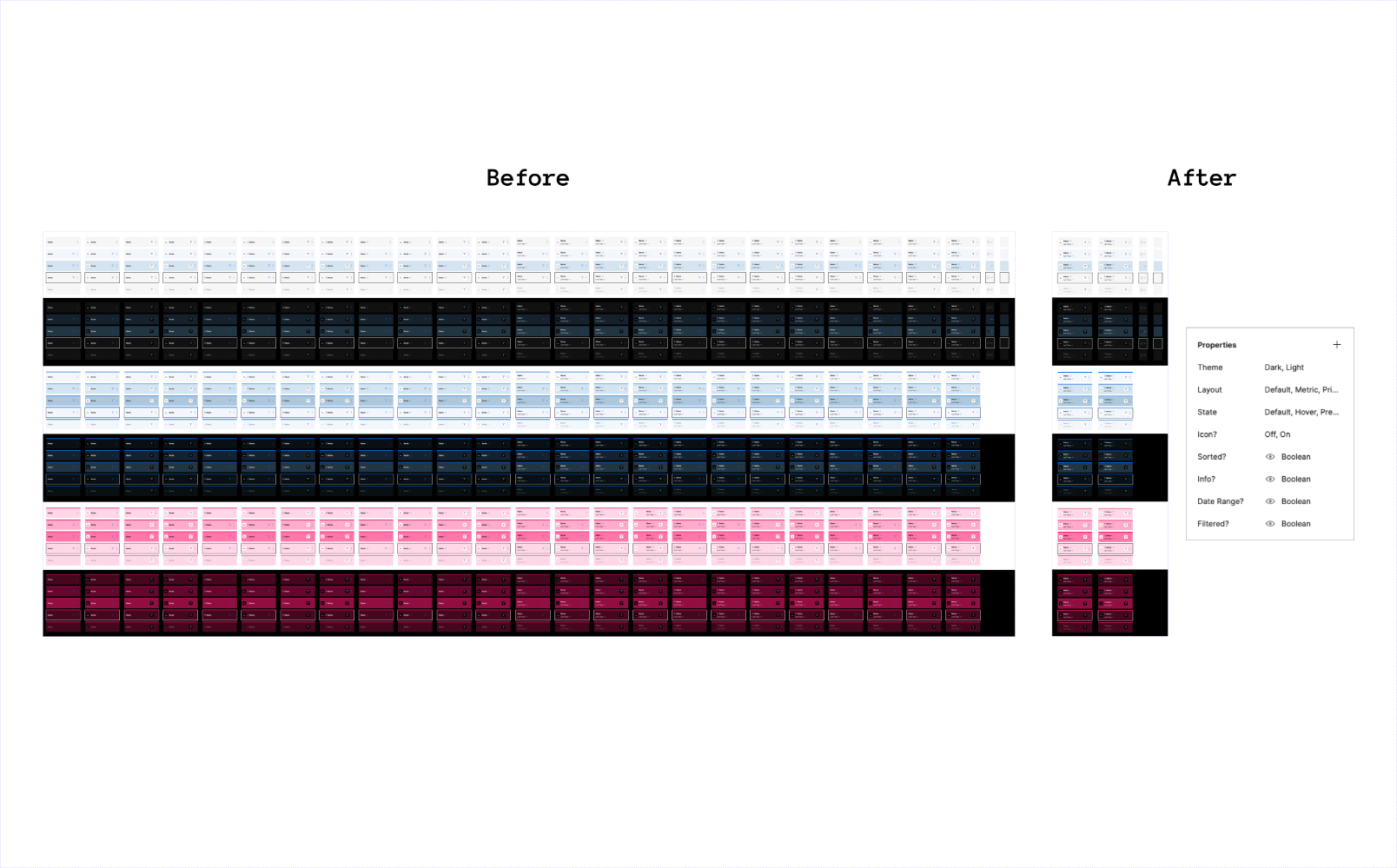
I also continued to implement new features in Figma to streamline how we worked, such as implementing component properties to reduce our table header variations while making variants more discoverable.